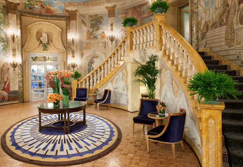
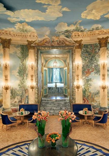
Rooms I love – and why. No. 1 in series. The Rotunda at the Pierre Hotel
Considered by many to be possibly the most beautiful room in New York, this room is a brilliant testament to the proper, if lavish, way to decorate a room. The trompe l’oeil murals created by American artist Edward Melcarth can only be truly appreciated while within the space proper. In fact trompe l’oeil is (when done well) best taken in while in person. It can seem to “move” with you as we have seen a portrait’s eyes do in the best of oils.
The room is clearly an excercise in flourish and abundance, but this is one of the styles that I adore. Largely because of the strict guidelines one needs to be successful in this exaulted medium. These kinds of rooms have rules; Fresh flowers only, furnishings kept to a mininmum to allow the room’s architectural styling to come thru and a very delicate balance of scale and proportions and much more. As with taking in the trompe l’oeil, the large room has the most visceral feeling of being intimate at the same time being large, that again, is only really appreciated in person. This is why the room is so impressive to me – to layer on exquisite layer after layer like that, and still have the room feel human is not easy to do. The less educated might see this as just a ridiculous exercise of an ostentatious showing of wealth or something, which it surely is as was done in those times. But in fact, and much more importantly, it shows the prowess of what great design can be. I see this same thing/different medium in a woman’s work I admire very much – Sylvia Weinstock’s wedding cakes. Her most elaborate cakes might appear to be very over the top, until you discern the proportions, scale, balance, tension and layers to it all – Just like good design with anything. Below; one of Sylvia’s masterpieces.
Like the cake above, the use of the smaller things in relation to the larger things, the layers of colour, and the “negative space” allowed, in the hands of someone untrained a room (or cake!) can turn into a riot of excess, rather than the restrained and glorified beauty that, again, can only really be appreciated in person. Here in person, you would see that the flowers on this cake are HAND Made petal by petal, and the walls of our room here are HAND painted, stroke by stroke.
Like the cake above, the use of the smaller things in relation to the larger things, the layers of colour, and the “negative space” allowed, in the hands of someone untrained a room (or cake!) can turn into a riot of excess, rather than the restrained and glorified beauty that, again, can only really be appreciated in person. Here in person, you would see that the flowers on this cake are HAND Made petal by petal, and the walls of our room here are HAND painted, stroke by stroke.
This dining room was so popular, that the “Tea Room” has been re-opened as a functioning restaurant in the Indiana State Museum, complete with original chairs, cutlery and china–with original menu items. I think with our mother, we would have had the famous Chicken Velvet Soup, with a Crouqe Monsiour or someting equally continental for the times, as in 1960-61 this was all a big deal! This, and the models wearing the finest dresses and suits that would parade the tea room while we all sat and dined. I remember looking upward from a base of one of the grand columns where I was seated. The view, the ceiling, the chandeliers and the window treatments are still kind of clear to me. I recall the colour of the sunlight coming in the room, and at once realizing that I was quite comfortable in this place. (How and why my mother would dare bring us hellions to lunch here,, we were horrible at home!! But, my parents took us out all the time, and we did behave pretty well I must say) Having been no older than 5 years old, these are less memories but indelible images – like in a dream. Later, when I was in upper grade school, I would be able to just look at a ballgown and know if it was Dior or Balanciega. Thus my love of fabrics, upholstry and window treatments!
The store had the most delightful animated Christmas windows. And a bronze cherub would mysteriously appear on top of the old Ayers clock just before Thanksgiving to announce the beginning of the Holiday shopping season.
Somehow, my favourite tea, Earl Gray seems most appropriate to have in such a civilized room, under the big dome and marvel at the hushed acoustics. More and more, the room just quietly unveils it’s fantastic design with the architecture down to the decor.
The hotel is famous in it’s own right with a saliacous history which you seem to have a precient awareness of. The building was designed by Schultze and Weaver who also did the Waldorf Astoria, and the Breakers in Palm Springs, after Mansart’s Royal Chapel at Versailles.
So, when my friends and clients ask me when did I start interior design? The answer is right around the age of 4 or 5! The evolution of my knowledge from that room in 1960 to today is a long learning curve that I hope will never end! Let me know some of your favourite rooms that you might like to share, or that you would like me to comment on – it’s always fun to share our design thoughts this way!


