Commercial Interior Design
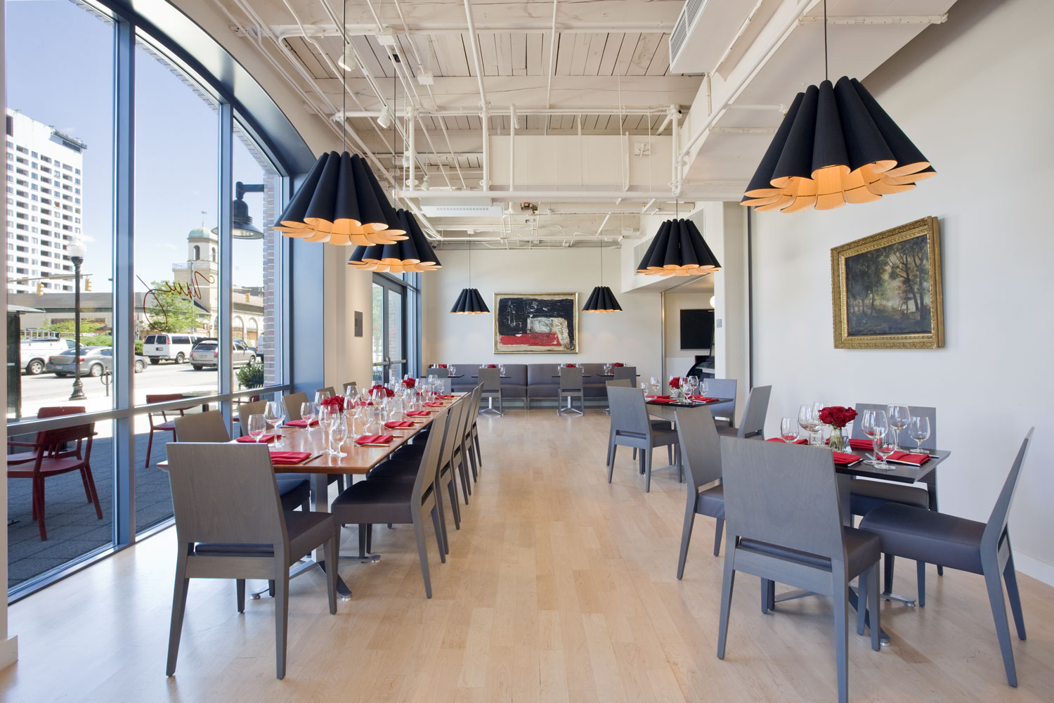
As part of MICA's Fred Lazarus IV Graduate Studio Center, we created a museum-quality dining spot with a heartfelt remembrance of Nancy Haragan, a friend of the college and notable Baltimorean. Known for her red lipstick and black skirts, the dashes of red throughout the building are an homage to Nancy. The custom light fixtures are from Argentina and recall Nancy's iconic black skirt.
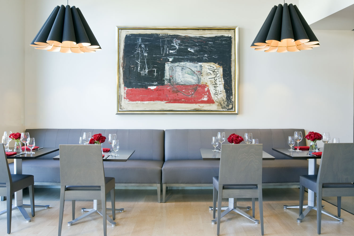
"Cafe Nancy" was designed with several purposes in mind. It needed to be a museum quality dining cafe along with a multi-purposed fine dining room for fundraisers, charity events and gallery openings. The custom banquettes hold court under a dramatic painting from Renaissance Art Gallery in Baltimore.
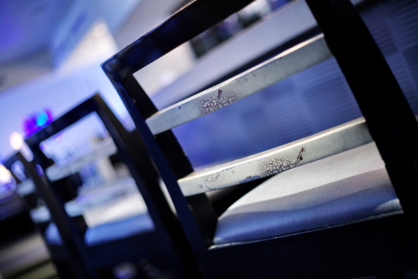
An unusual finishing technique can take a simple shape a long way. Here, the Dara barstools from Hickory Chair start with an incredibly strong construction and classic form. We used black lacquer finish with a silver nailhead motif on the vinyl covering on the seats. The scene stealer? The distressed silver leaf stretcher bars on the back of the stools.

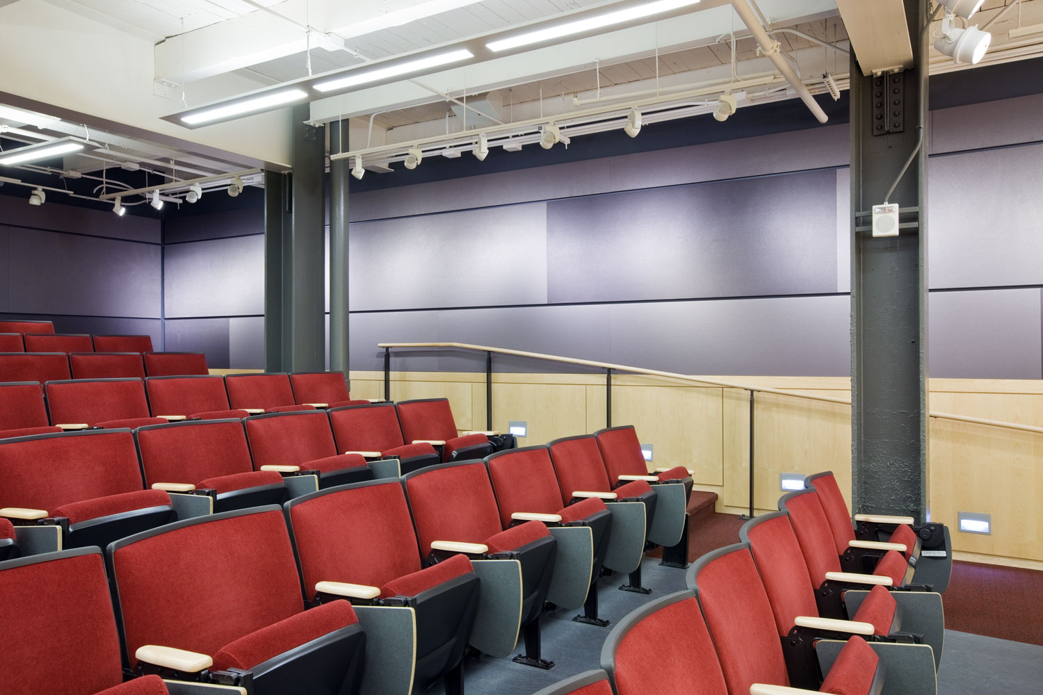
How do you elevate a 140-seat theater/auditorium with little opportunity for ornamentation or decoration? We created drama by covering the seats with dark red mohair.The juxtaposition against the contemporary space and the unique grey neutral, create a wonderful element of tension to augment any gathering of interest.
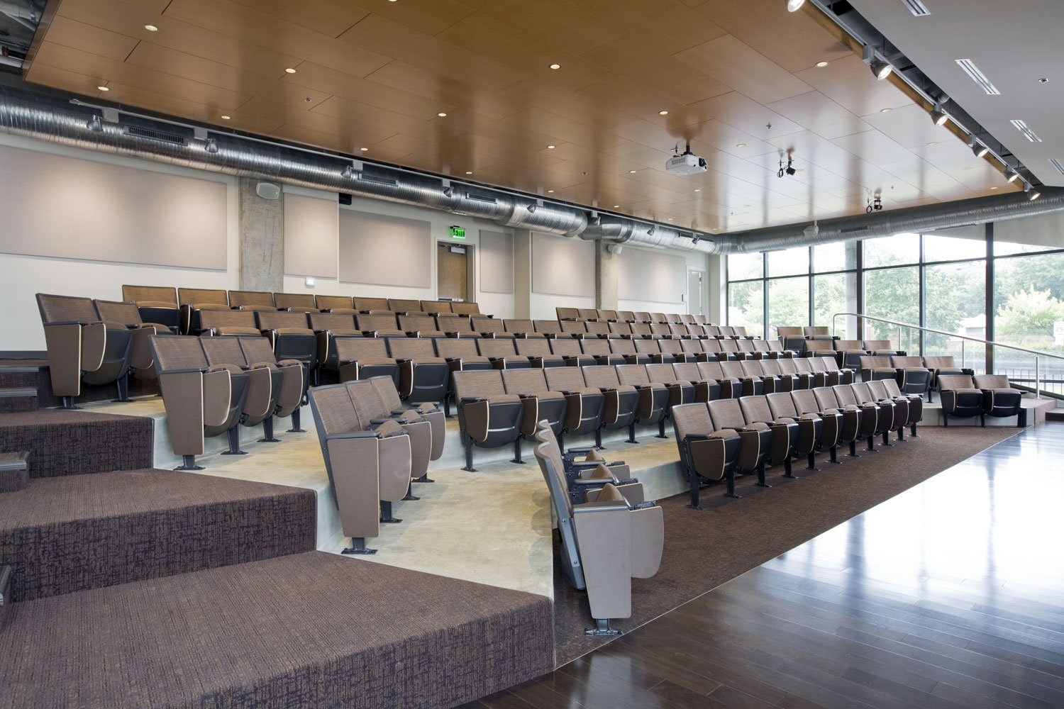
This 180 seat auditorium is a study in monochromatic use of shades of brown. The hardwood flooring continues as a stage floor and bends to form the wall covering behind the stage. The walnut tablets on the chairs compliment the brown fabric with copper threads running throughout. The wall of windows create a unique "barrier free" image when looking into the space from the busy street.
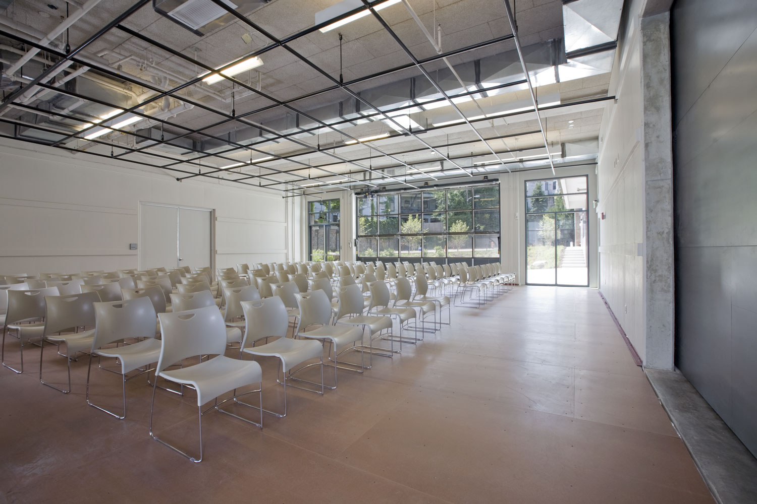
Very much a true black box theater, we rendered this one in pale creams and off whites. The oversized garage door style "window" lifts in a unique fashion, not unlike a garage door. The flexibility of the moveable walls, the large garage door allow this space to become less of a typical space and more of a extravagant void in the middle of this building. Perfect for the Baltimore wedding of the year!
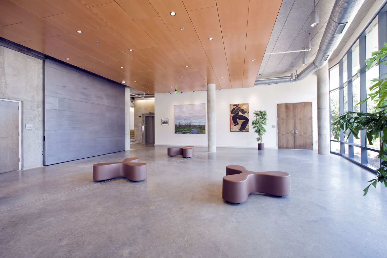
This grand open space is used for pre-function gatherings, mobile exhibition displays and traffic buffering for the auditorium space beyond the very tall walnut doors.
Here the "Flower" benches from Vitra, simply float and move about the space as needed.
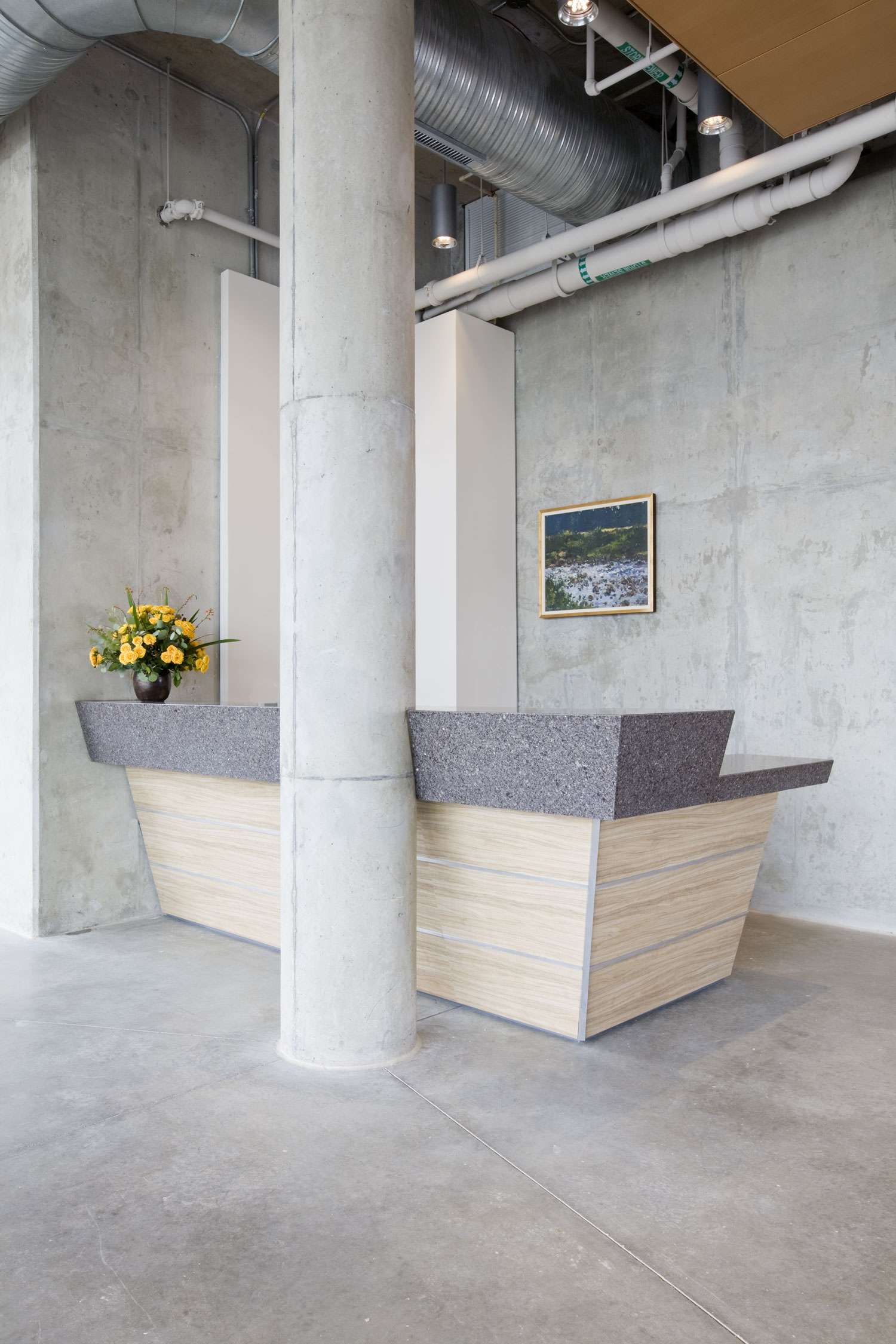
This beautiful and energetic desk is made of concrete and marble and is a masterpiece of complicated lines, angles and cuts. Continuing the "thrust" of energy that emanates from this corner of the large lobby, the desk "explodes" from its space and nearly bisects the round column. The layers of angles that form the transaction top give way to similar angles in the face portion, now pulling away from the round column. Designed by Forshew Design and realized by Khan-Struction Millwork and Design.
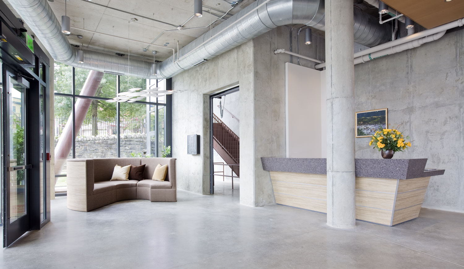
The corner of this large lobby creates the thrust of energy for this bold space. The custom sofa created by Forshew Design provides the perfect compliment of energy, style and size.
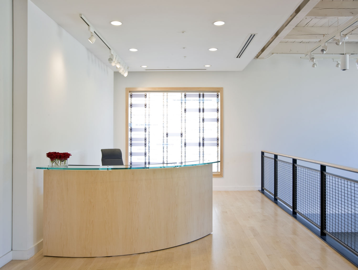
At the entrance of MICA's Fred Lazarus IV Center, we custom matched the reception desk's clear maple stain and finish to perfectly match the maple hardwood flooring. The crystalline glass panels behind the desk offer a unique method to display the names of donors.
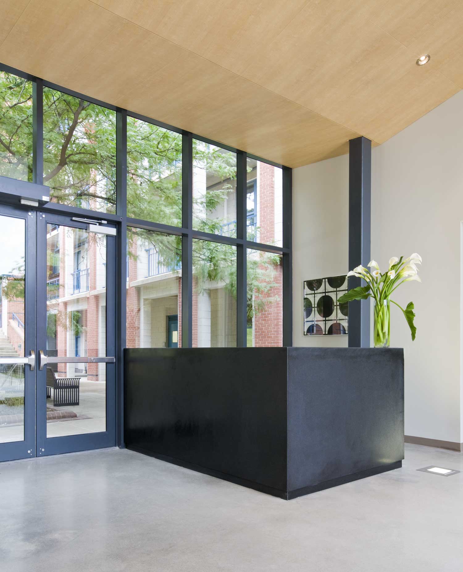
This entry structure was created with a great deal of glass supporting a curved roof imperceptibly floating above the space. The Interior design intent was to create a Bauhaus/ International style classic counter - completely of honed black granite with mitered corners and seams. The result is a very classic and timeless environment. Floral design by Forshew Design.
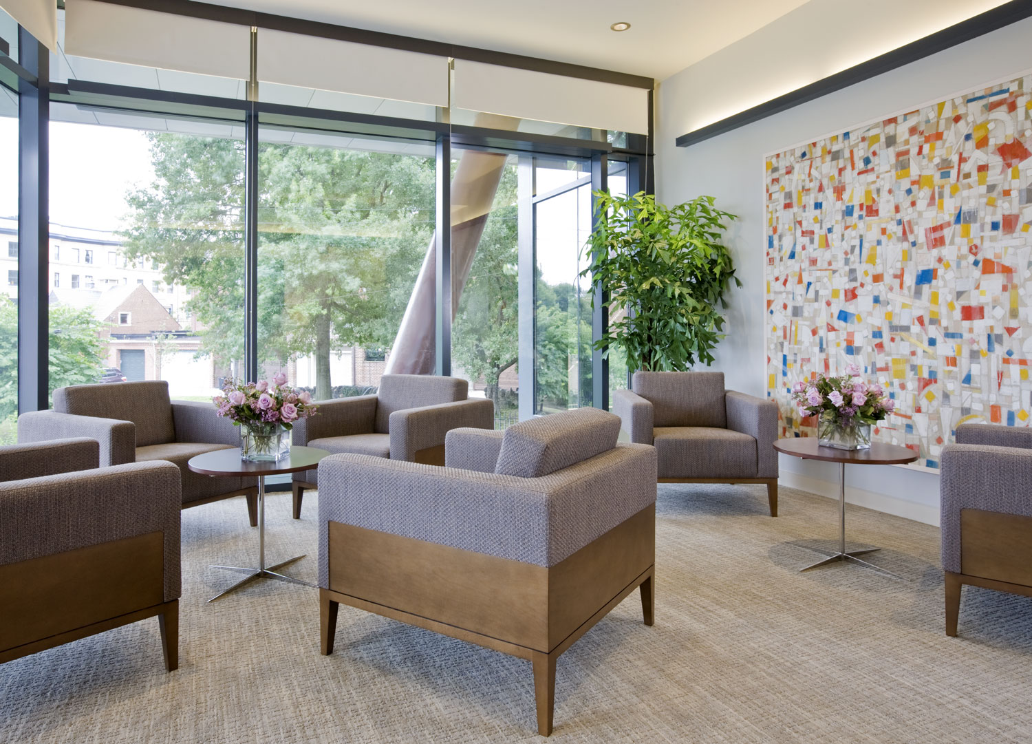
This sophisticated lounge is anchored by an over-sized abstract painting. The soft grey tweed against the walnut wood allows the chairs to remain soft while standing up to the energy of the painting. Floral design by Forshew Design.
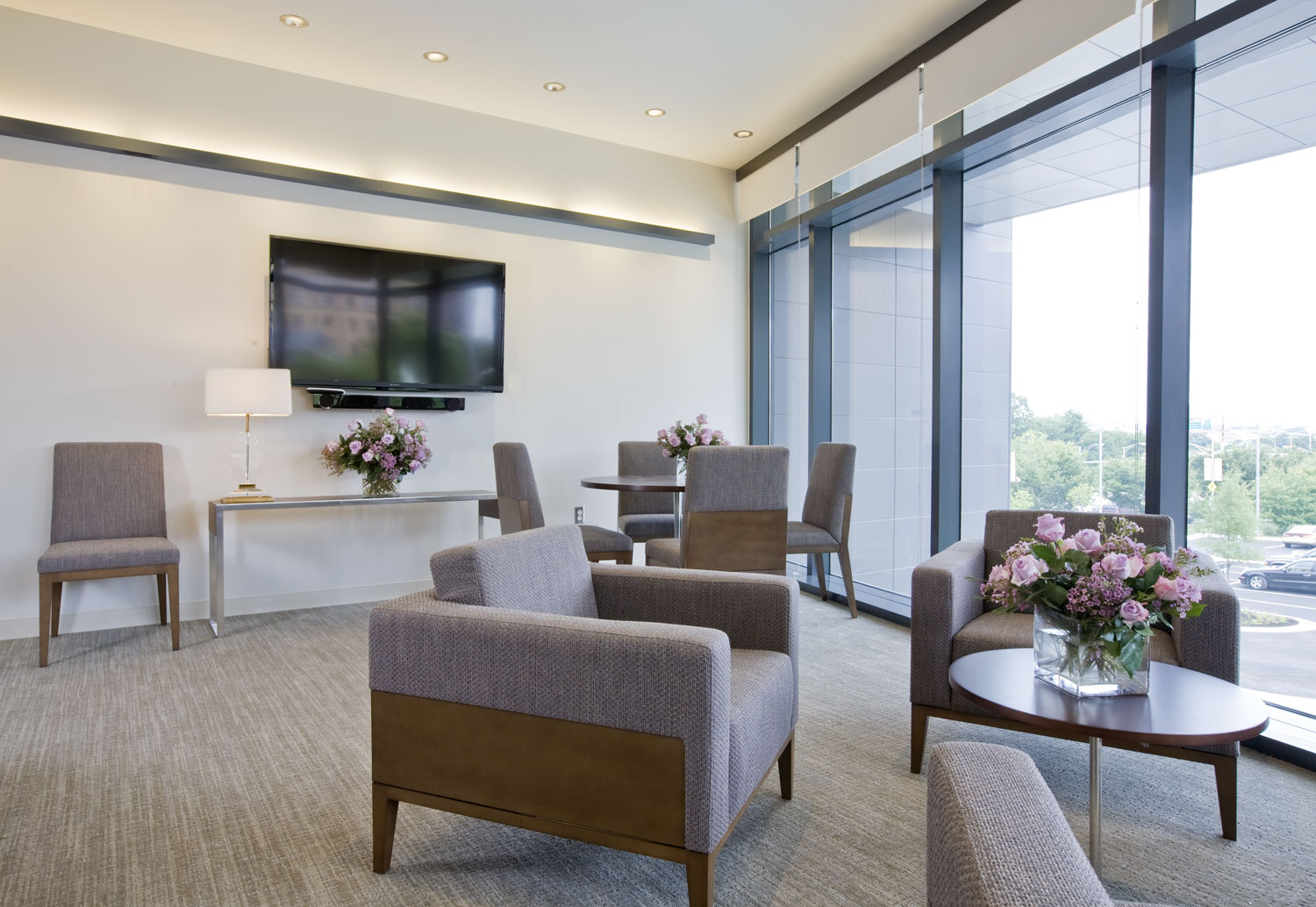
The angular shapes of this room are amplified by the seating's lines and the horizontal light bar above the TV. The multi-height tables include a console for display; a work table for meetings; and lounge height tables near the seating areas.
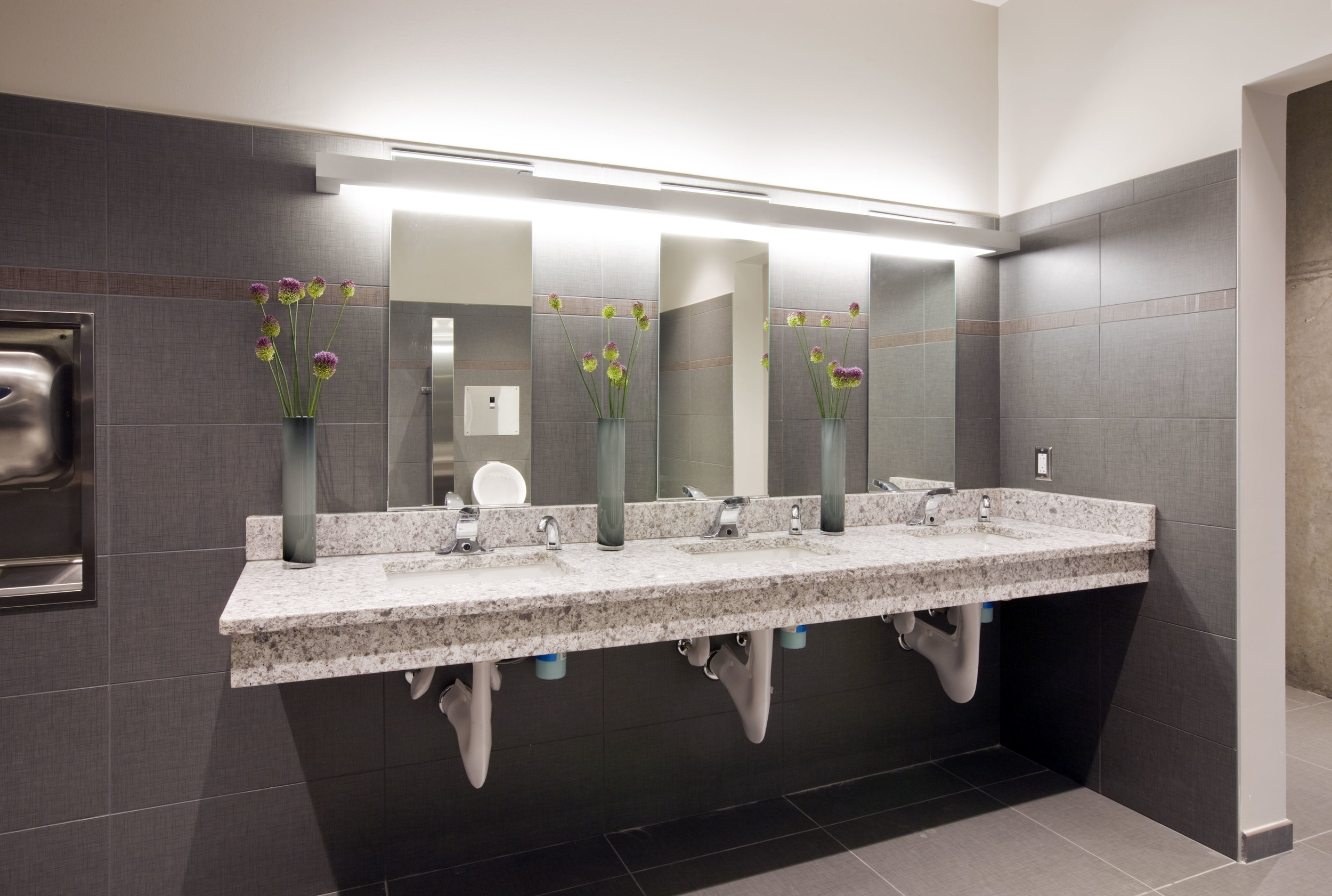
The dramatic placement of mirrors behind a long horizontal light bar echoes the interior design motif in the wall tiles; "Kimono Silk" by Dal Tile. Note the chestnut coloured band running horizontally throughout the space. The Silestone countertop matches the grey tiles perfectly.
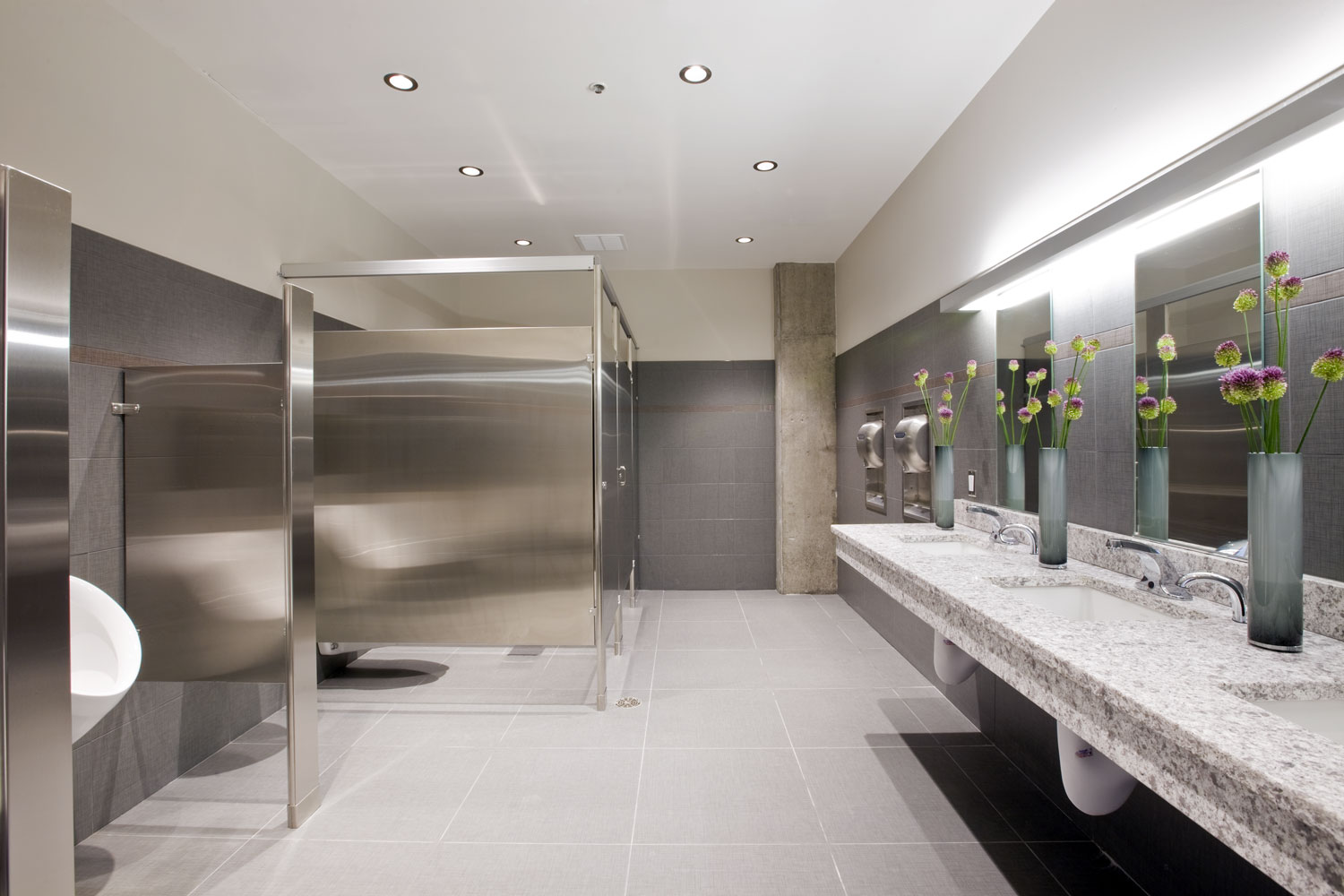
This space is all about rectilinear arrangement of the grey wall tiles with the soft brown listello strip running horizontally around the room. The gleaming stainless steel, and brushed chrome light bar combined with the raw concrete column creates the most wonderful tension in what is normally a bland public space.
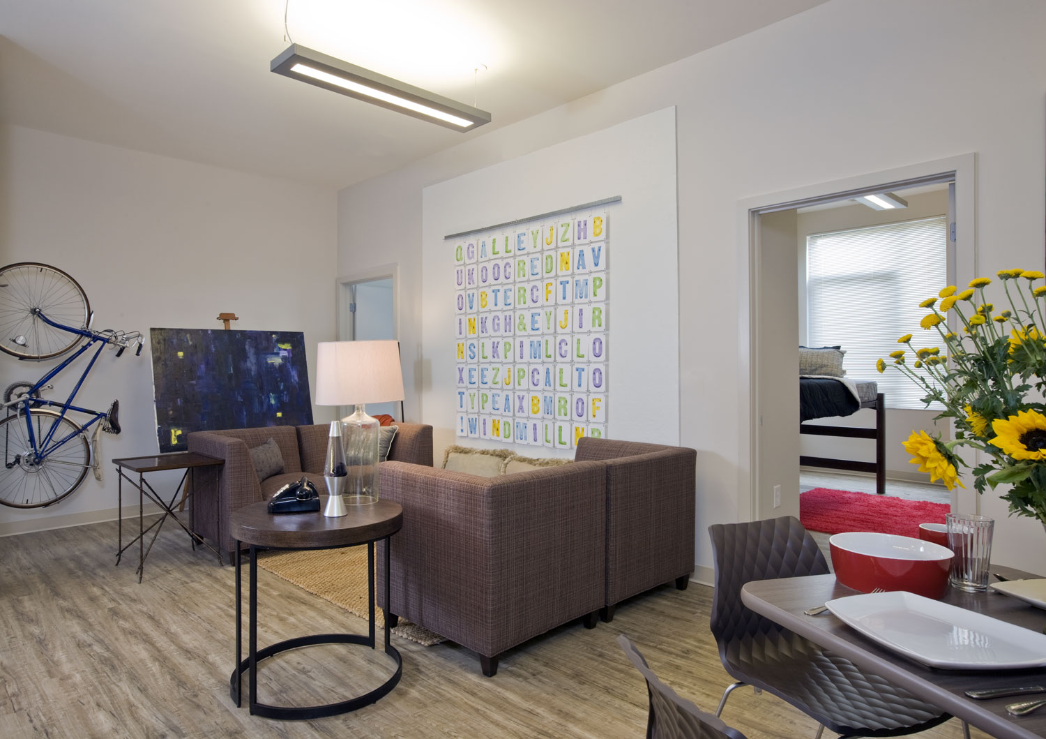
This image of the typical student living room shows the unique custom cube shaped upholstered units that come together in many ways to create single seating, or a pair of love seats (shown) or one big "cube” ! Custom seating by Forshew Design.
The driftwood style flooring is actually high quality, very durable vinyl flooring.

The durable stainless steel counter tops contrast nicely with the espresso stained cabinetry. The students share this common space and can use the table as a dining table or work table. The neutral brown colours hide the dirt and work well with most any colour the student might bring to set up their apartment.
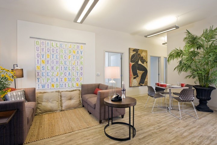
The goal for creating the new student apartments at MICA's Leake Hall and Founder's Green residence life project was durability and flexibility. The corner upholstered units are easily coupled together to form L-shaped seating with love-seats and single chairs. The driftwood coloured flooring is a high performance luxury vinyl by Armstrong.
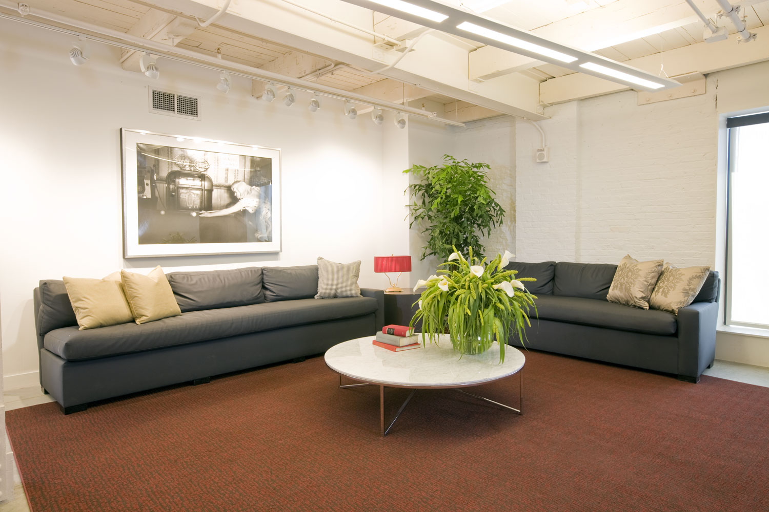
On each floor of the building created for graduate art studies, custom seating in a unique charcoal vinyl that appears to be fabric, contrasts with the deep red area rug and long bench fabric, again a durable vinyl. The contemporary and durable marble tables hold the design quotient when paired with a rare image, just out of sight, of Marilyn Monroe playing pool with Paul Newman. This oversized Silver Gelatin print was created by one of Marilyn's photographers, Eve Arnold.
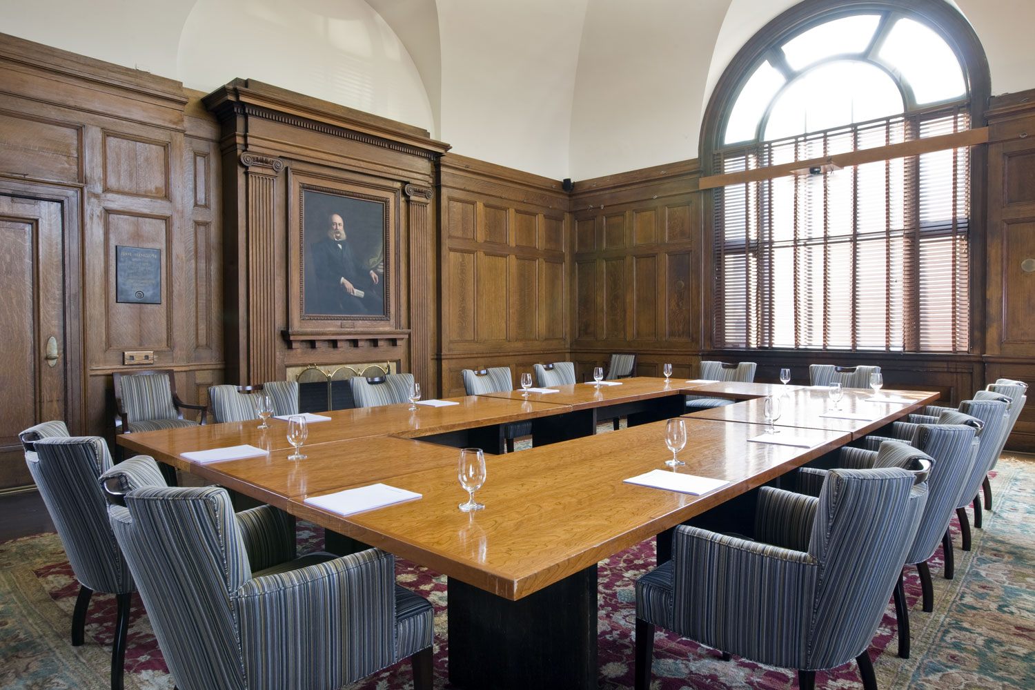
This Oak paneled board room features soaring ceiling transitions that arch upward to the oversized pendant bowl lighting fixture. A portrait of one of the school's founders holds court over a room that, while steeped in tradition, is not a slave to one period. The softly upholstered chairs speak to both a mid-century feeling and a contemporary line as well.
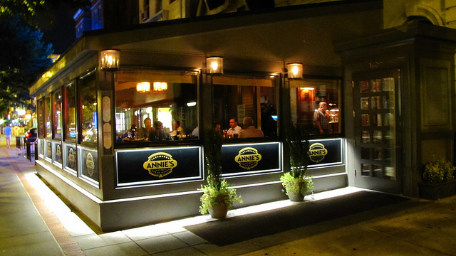
This evening image shows the re-created facade to best effect - a dining room that is happily filled with patrons. In redefining a classic venue, the interior design of this restaurant needed to be sensitive to the long standing brand image.
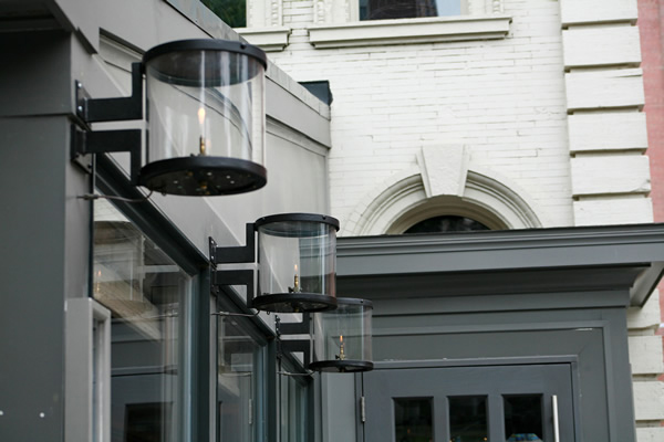
The entry of this Washington, DC restaurant was a cacophony of colour. Re-framing for a custom multi-light door and custom round gas lamps set the foundation to recolour the exterior in shades of alabaster white and stone greys.

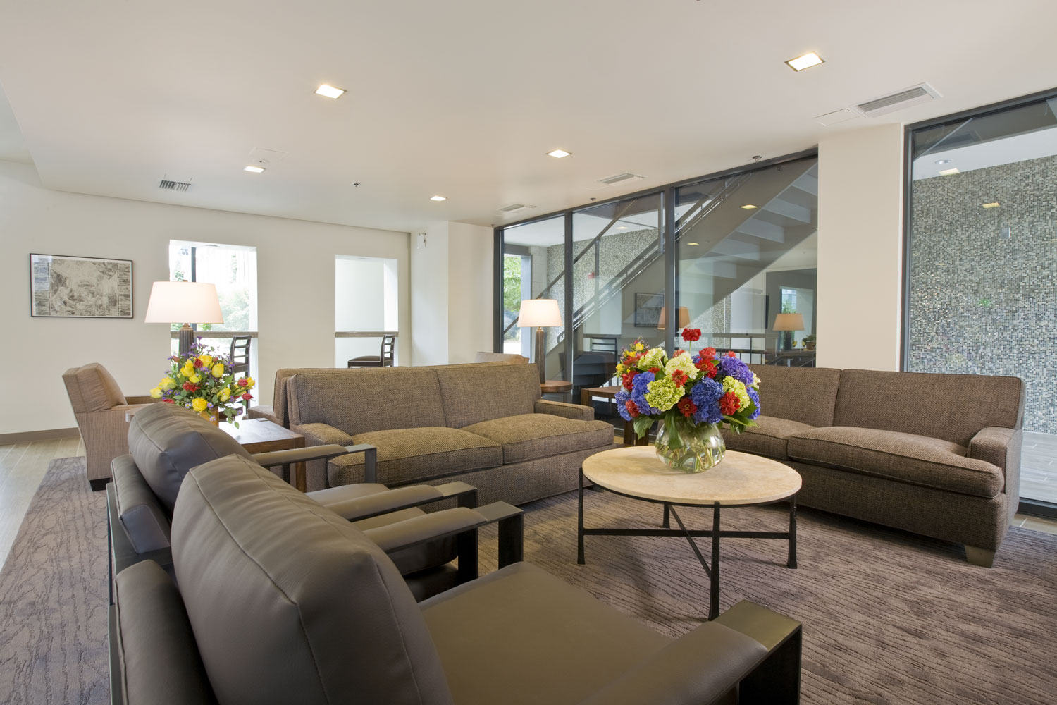
This soft seating area is adjacent to the student dining area, and creates another spot for conversation. The walkway seen through the glass windows is a major thoroughfare and meeting spot. The mosaic tiled wall beyond glimmers with iridescent colors. Floral design by Forshew Design.
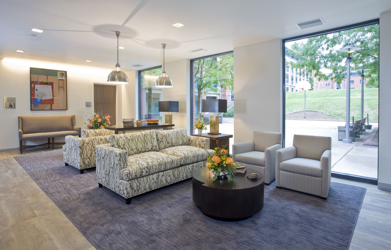
Spectacular artwork combined with contemporary glass wall panels set the stage for relaxed but inspired seating. The area rug by Karastan has a wood grain motif that compliments the climbing floral motif aptly named "Climb" by Maharam. Lighting by Visual Comfort.
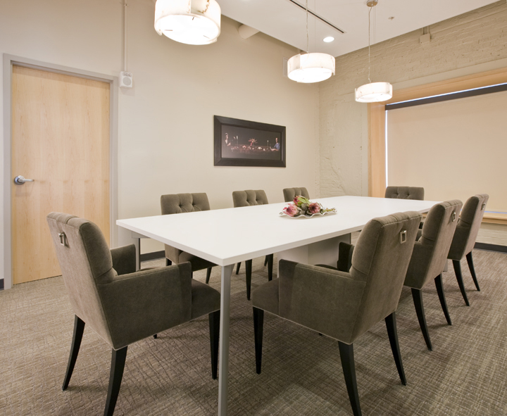
This conference room shows the great effect of positive tension created with the juxtaposition of materials: grey mohair with black lacquer. Clean white laminate table top with alabaster wrapped lighting - contrasted with an old masters painting. This room was chosen by HBO as a backdrop for several filming projects.
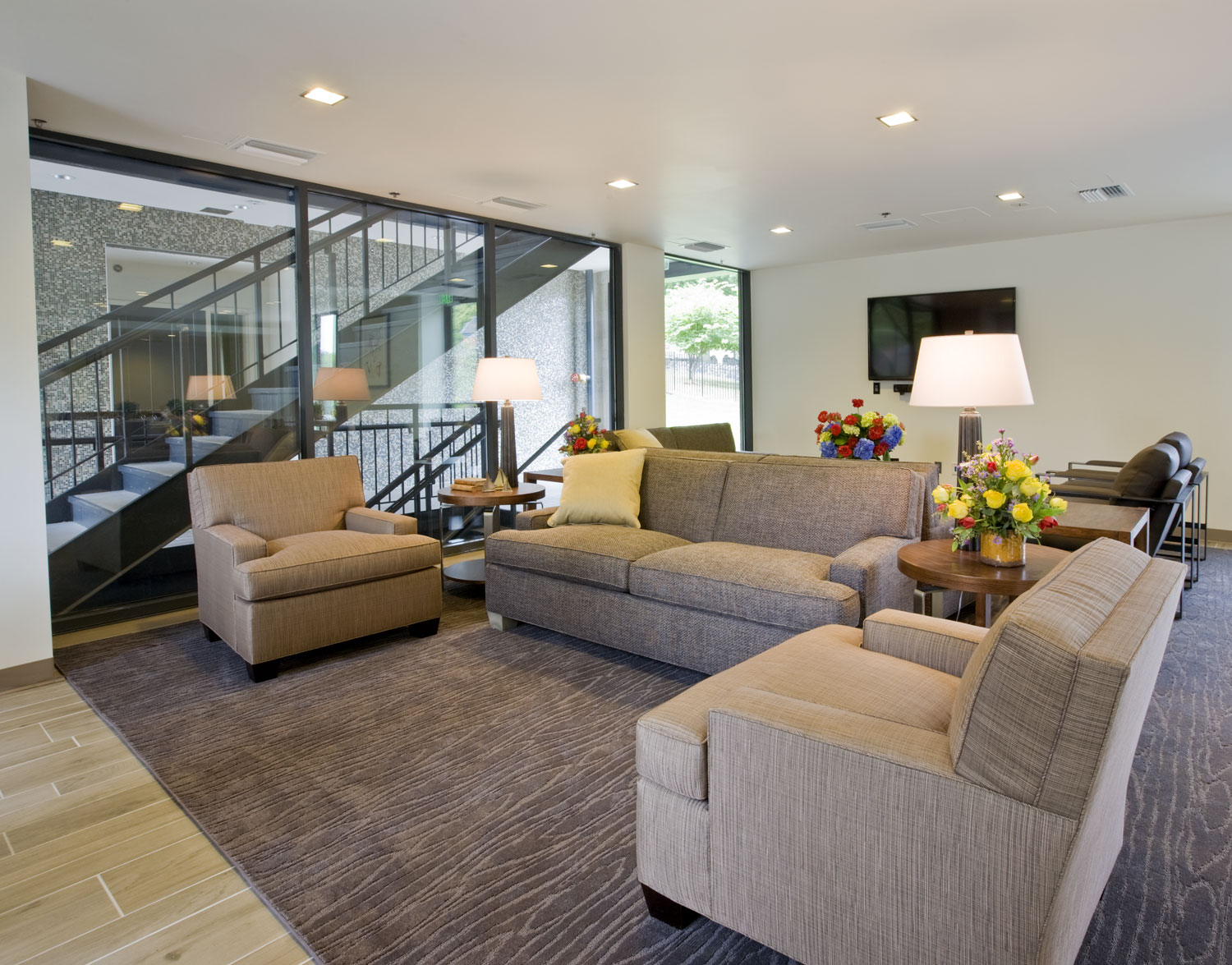
The interior design for this space was intended to capture the energy of the walkway beyond the glass, and create an opportunity to "see and be seen." The idea works well for a luxury hotel property as much as it does here for a student lounge.
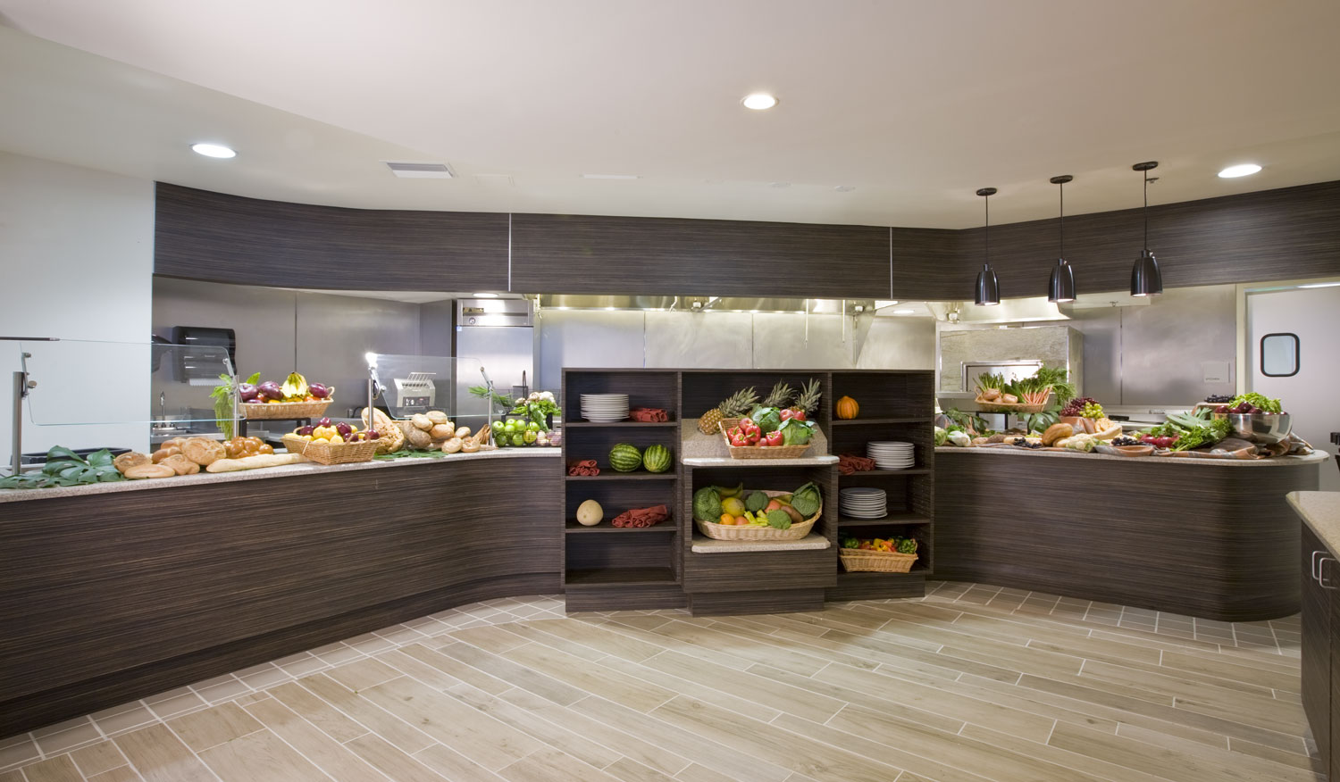
As part of an open dining concept - display oriented buffet service is shown with the custom banding of walnut veneers, pinpoint diamond stainless backsplash walls and custom pizza oven, chilled marble serving slabs and a focus on upscale, fresh food preparation. The flooring is a ceramic plank in a driftwood color. Cabinetry, hood and valance, ovens designed by Forshew Design with Ashland Kitchen Design.
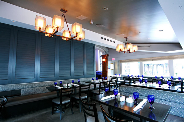
The reflective surface of the ceiling allows the placement of darker furnishings by amplifying the available light. A pearlescent paint from Benjamin Moore was used in an automotive style finish when sprayed on in successive coats. Lighting fixtures by Fine Art Lamps.
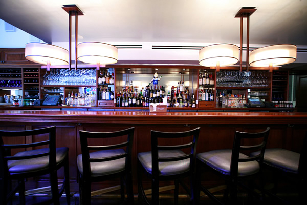
This magnificent bar is realized in a warm finish and shows application of face panels, solid stature and the wonderful classic rolled edge where one can rest an arm. The back bar continues the fine mouldings, custom cubicles and mirror backed storage. Lighting by Fine Art Lamps.


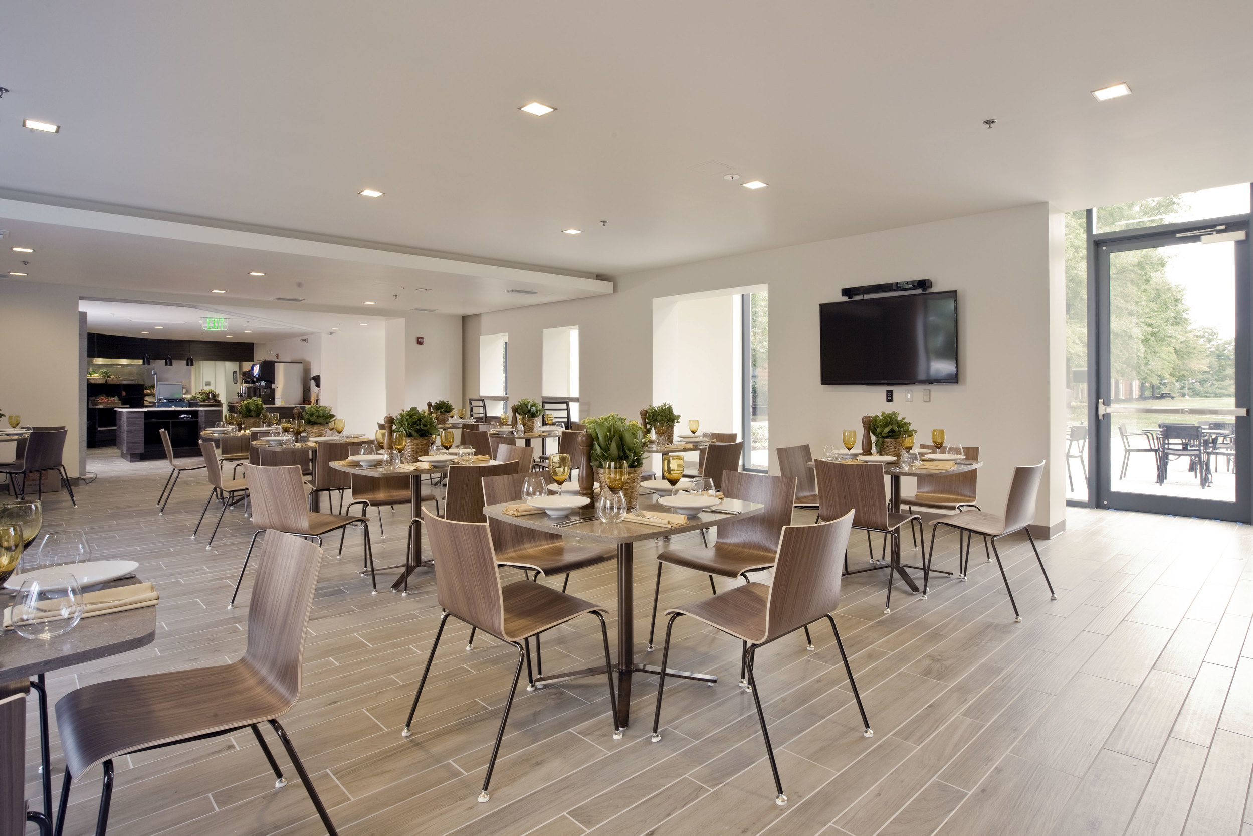
The porcelain flooring looks like hardwood and the black walnut chairs and statuary bronze bases for the Silestone tops create a very neutral theme for this multi-discipline use space. Chairs by Sandler Seating and tables by Cumberland.


“Working with Bradley was a great experience. He really put a lot of time and effort into understanding our business needs and goals. Six years later I’m happy to know that the choices he helped us make are still proving to be good ones”
On Time, On Budget, Perfectly Executed Commercial Spaces That Convey Your Identity
Business owners turn to Brad when they need a signature look that will represent the corporate brand or their personality.
Restaurant, Condominium and Hotel Interior Design - Brad Weesner has created interiors for the Maryland Institute College of Art, and the Washington, DC landmark - Annie’s Paramount Steak House and Frederick's Weinberg Theater. His experience in luxury hospitality, new home sales and real estate management make his firm ideally suited for a variety of commercial projects.
Professionalism and Competence – Brad is known for working well with architects, builders, and other teams involved with the process. While starting with your architect is always the best approach, Brad is able to work with spaces that are still under construction as well as finished homes needing a remodel.
