Residential Interior Design


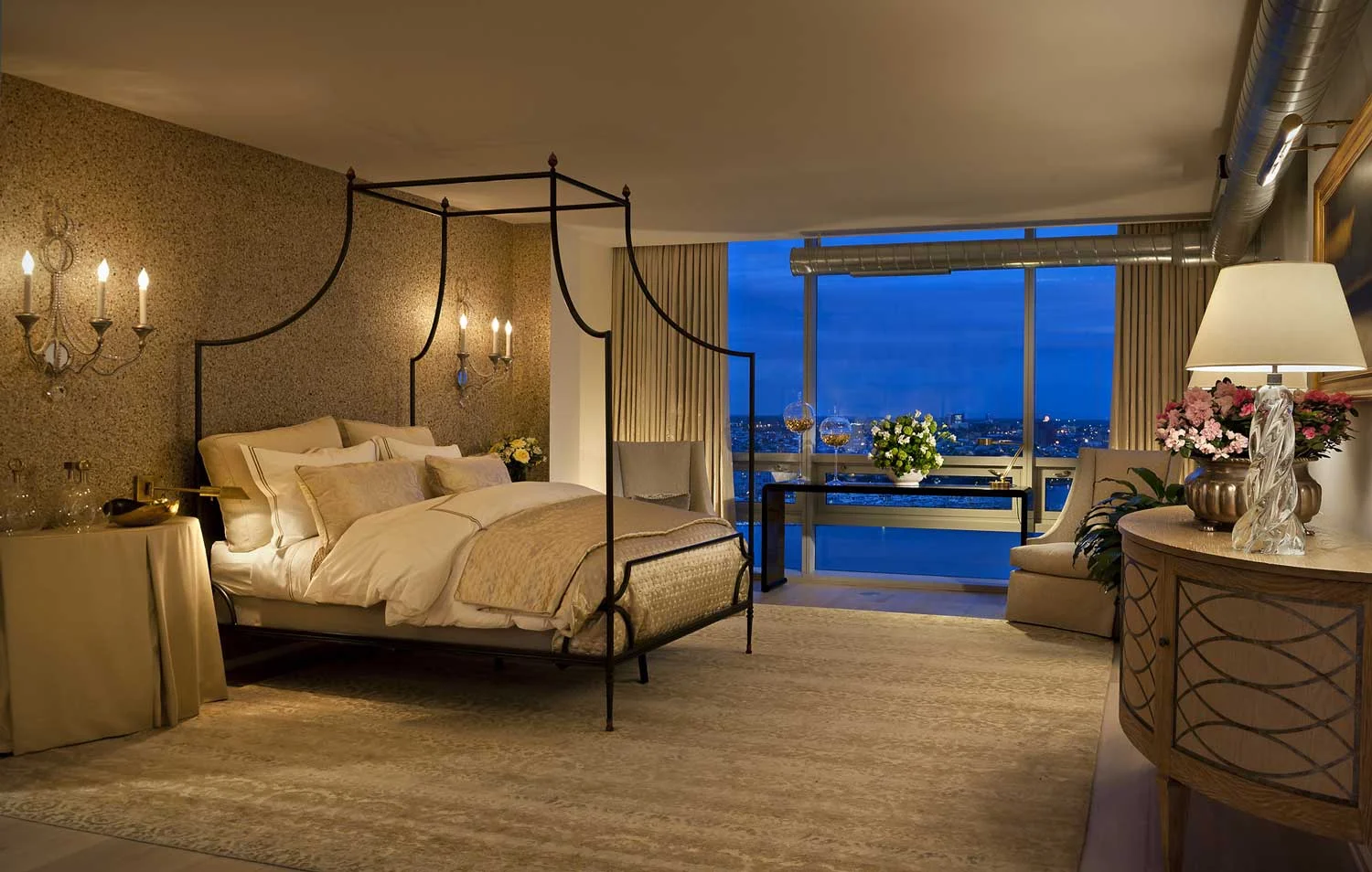
The dramatic views provide a great deal of energy, that we softened with graceful curves, layers and layers of silk bedding and custom bed coverlet, pillows and bolsters. The Danieli Sconces from Niermann Weeks, the stone surfaced wall covering from Phillip Jeffries and the Forshew Design custom skirted Demi-lunes all add a sense of grace and finesse at the same time providing a very approachable and welcoming space.
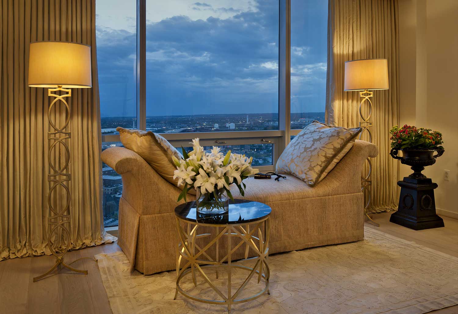
A cool northern light from the sunset provides a twilight blue colour contrasting with the soft sand colours in this master bedroom. The placement of the large bench against the floor to ceiling windows helps anchor the space. Perfect for reading, or a nap, this adjunct area of the bedroom provides the needed respite that is best found in one's bedroom.
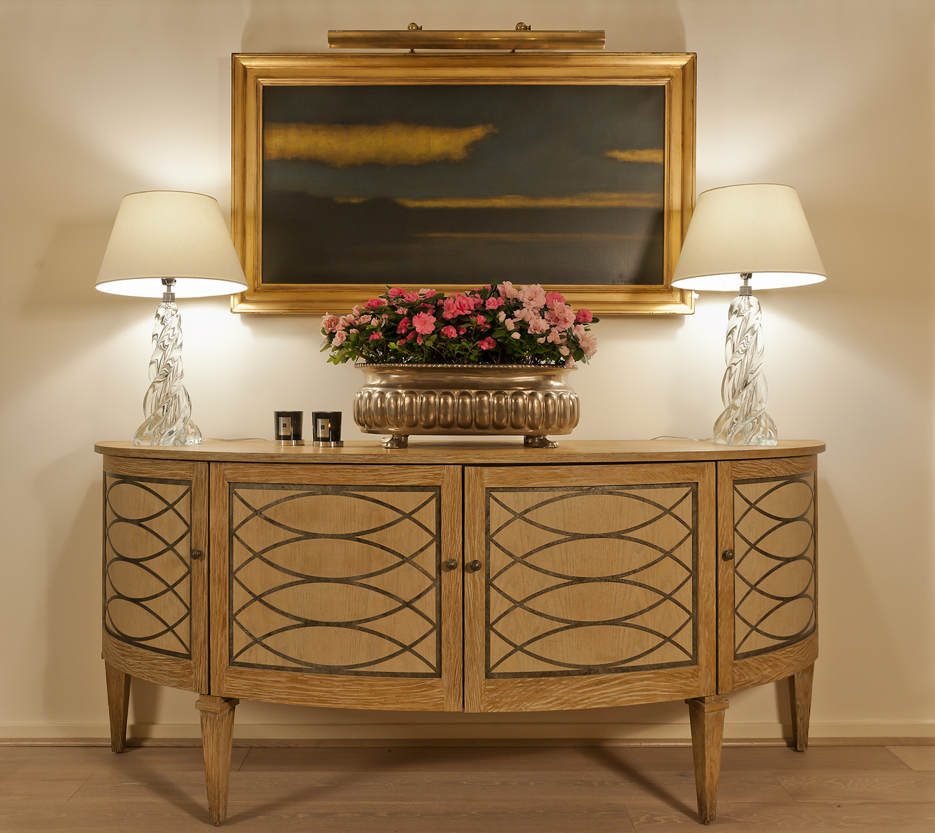
This dramatic Niermann Weeks "Renishaw Commode" sets the stage for a display of Ron Dier's ceramic cachepot and the wonderful placement of Kevin Fitzgerald's finest example of an evening sky - capturing the delicate light of twilight in the way only Kevin Fitzgerald can do.


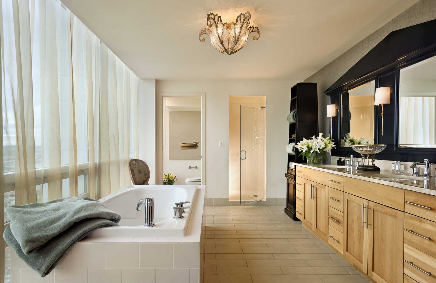
The dramatic custom Girandole mirror sets the framework and architectural statement for this interior design statement in Baltimore's finest penthouse condominium. Note the focal point of the fine art piece from Renaissance Art, the ceiling fixture from Niermann Weeks that all come together for the stature needed to hold up to the spectacular views.
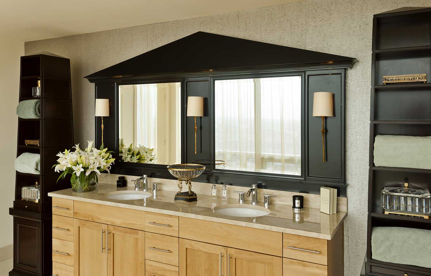
Known in other incarnations as a Girandole Mirror, this execution designed by Forshew Design, in strong Egyptian motifs, the result is all in the details. Note the soft pitch in the pediment of the mirror, matching that of the tall Baker Pyramid cases in black lacquer. The beveled mirrors, striking ancient torch sconces create the right balance of form and scale.
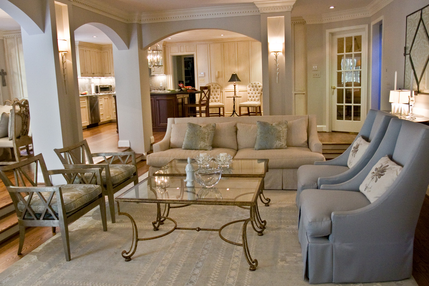
The interior design of this room is best noticed in our "before and after" section, and here the interior decoration shows a study in multiples. The detail of the wall sconces set into each side of the columns allow enough light to avoid the overhead recessed lights. Also of note are the graceful arches echoed in the motif of the curves in the coffee tables, and the arms of the Baker High Back lounge chairs.
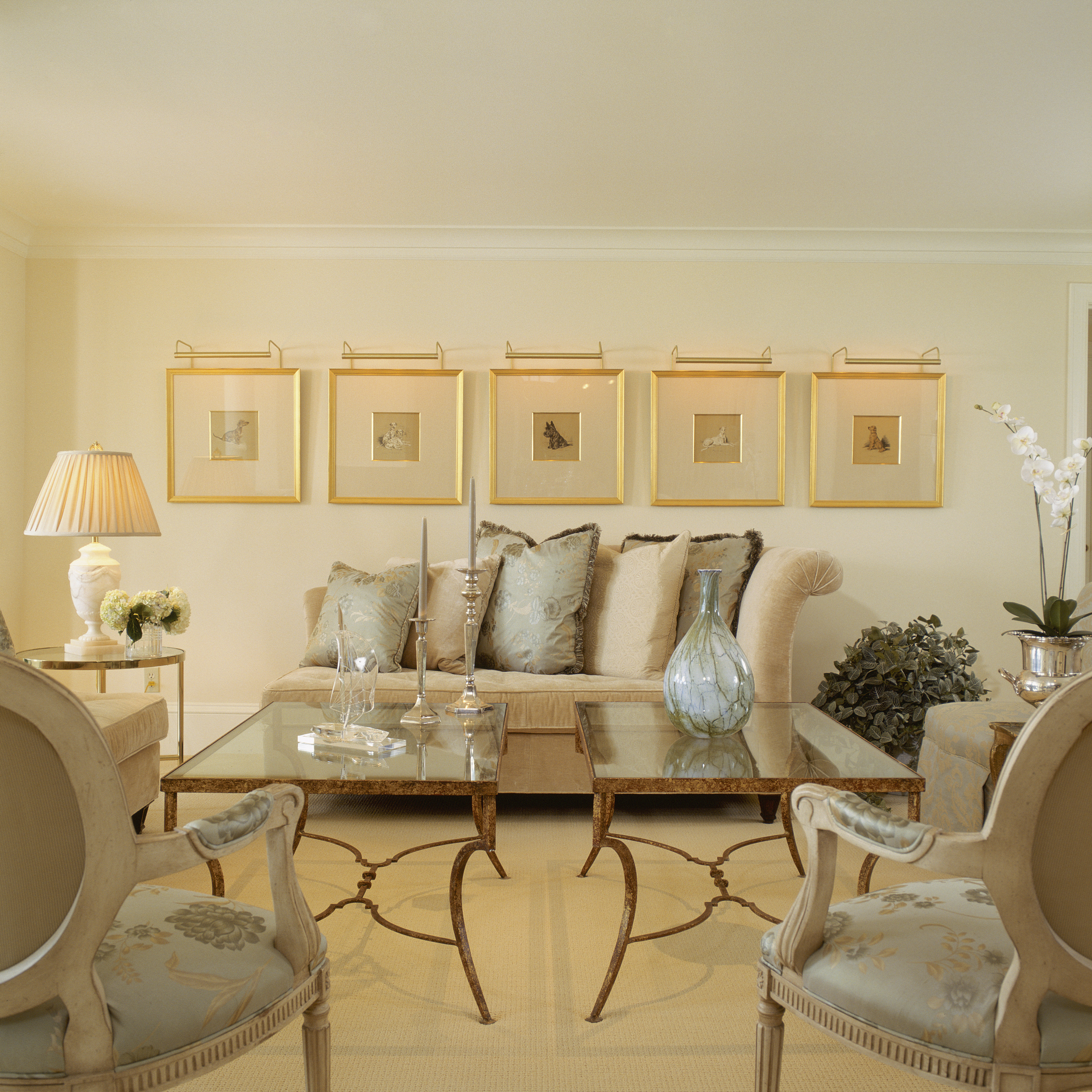
While not apparent, this wonderful family room space located on the lower level of this home, provides durable protection with mohair on the sofas, glass topped tables, sturdy sisal carpeting and the dramatic focal point of the framed Lucy Dawson dog prints in multiples.
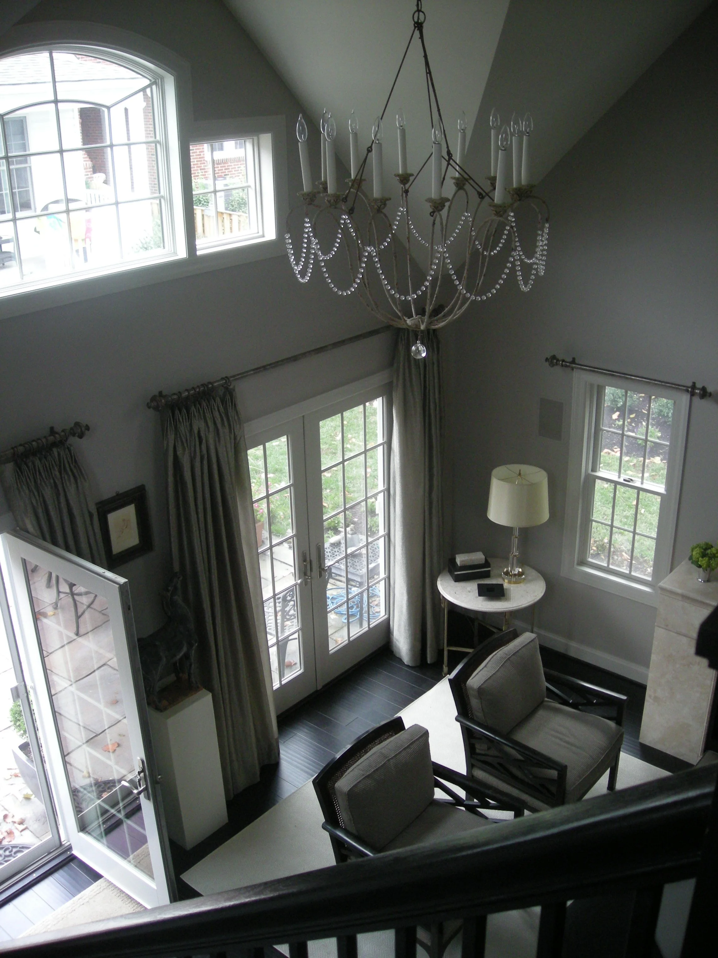
Even less apparent - this room converts to a home theater with a press of a button. The screen and projector lower from the ceiling, the full width curtain panels over the French Doors (out of view) close and in the darkened room, the multiple art lights dim as the movie begins.
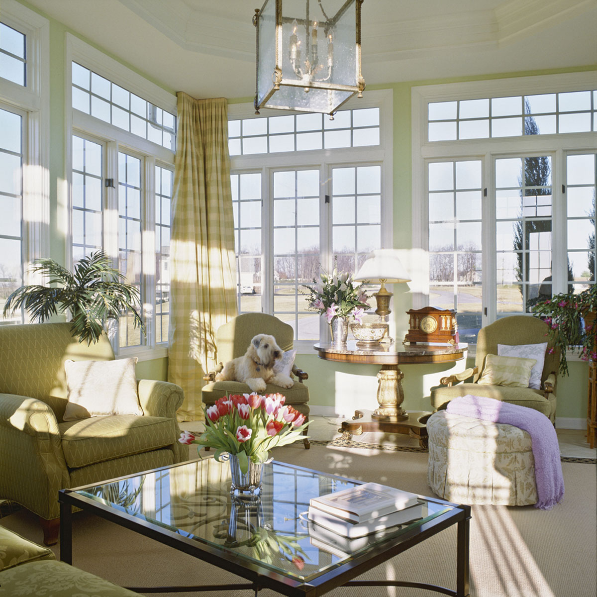
The mix is casual, the fabrics and finishes are durable using; marble and glass topped tables, outdoor fabrics on the seating and yet formal in silhouettes the interior design effect here is one of sophisticated ease. Lantern out of views by Niermann Weeks, pedestal table by Drexel Heritage.
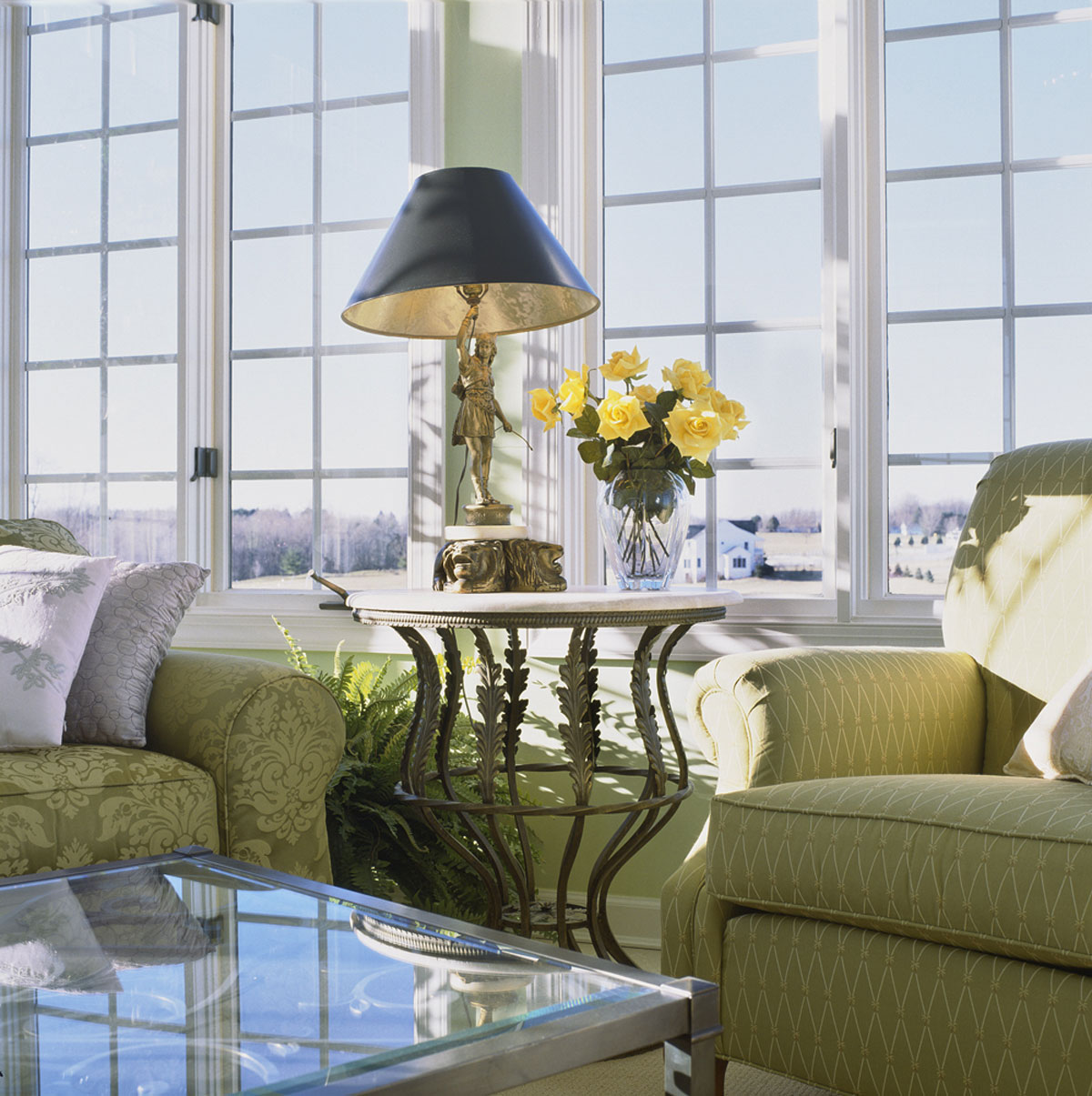
This simple image belies the beautiful curve of the Acanthus table mirrored in the curved arm of the upholstered lounge chair.
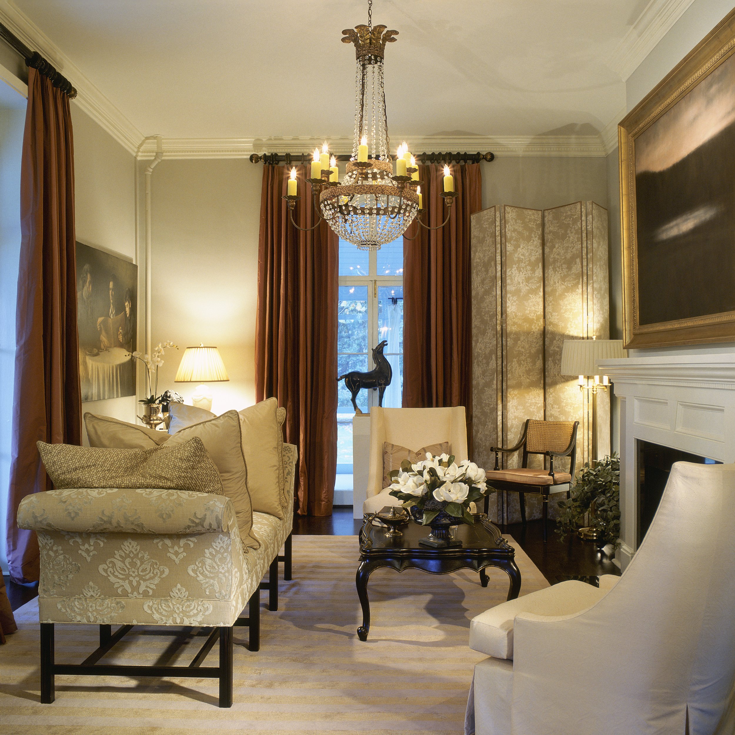
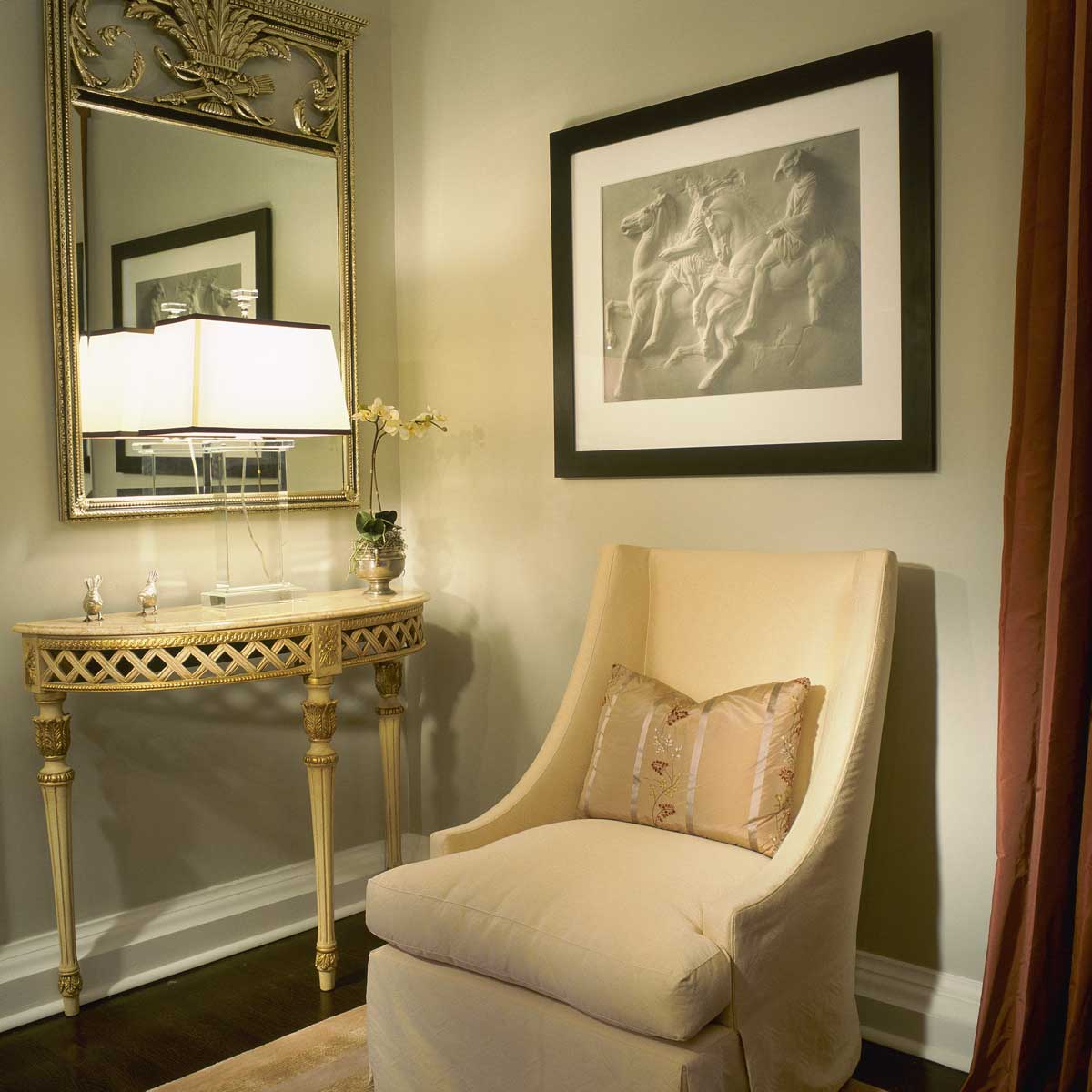
As a vignette image, this shows perhaps the best illustration of neo-classic forms that are pared down to create a clean, spare take on the classic forms. To further echo this, the framed graphite shows Scott DeMontelan's "Parthenon" which was executed in the pointillist style for a truly stunning 3-D effect. Classic, No?
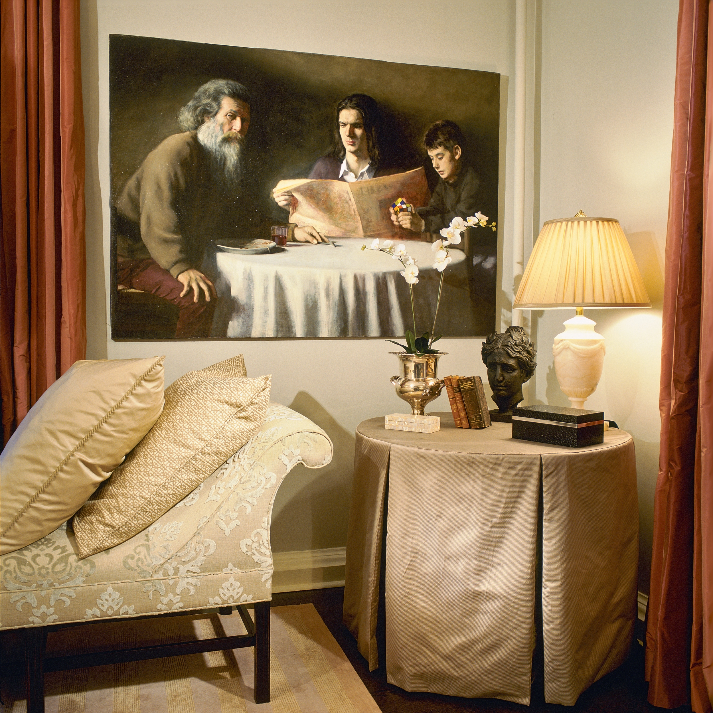
This custom skirted table created by Forshew Design is fashioned from a silver ottoman silk with charcoal lined inverted pleats. The structure of this table skirt holds up well with the dramatic lines of the Montmorenci Bench by Hickory Chair - here realized in an extravagant cut velvet in taupe and silver.
The oil painting, "The Three Ages of Man" by Greg Horwitch, is a commanding complement to the scene.
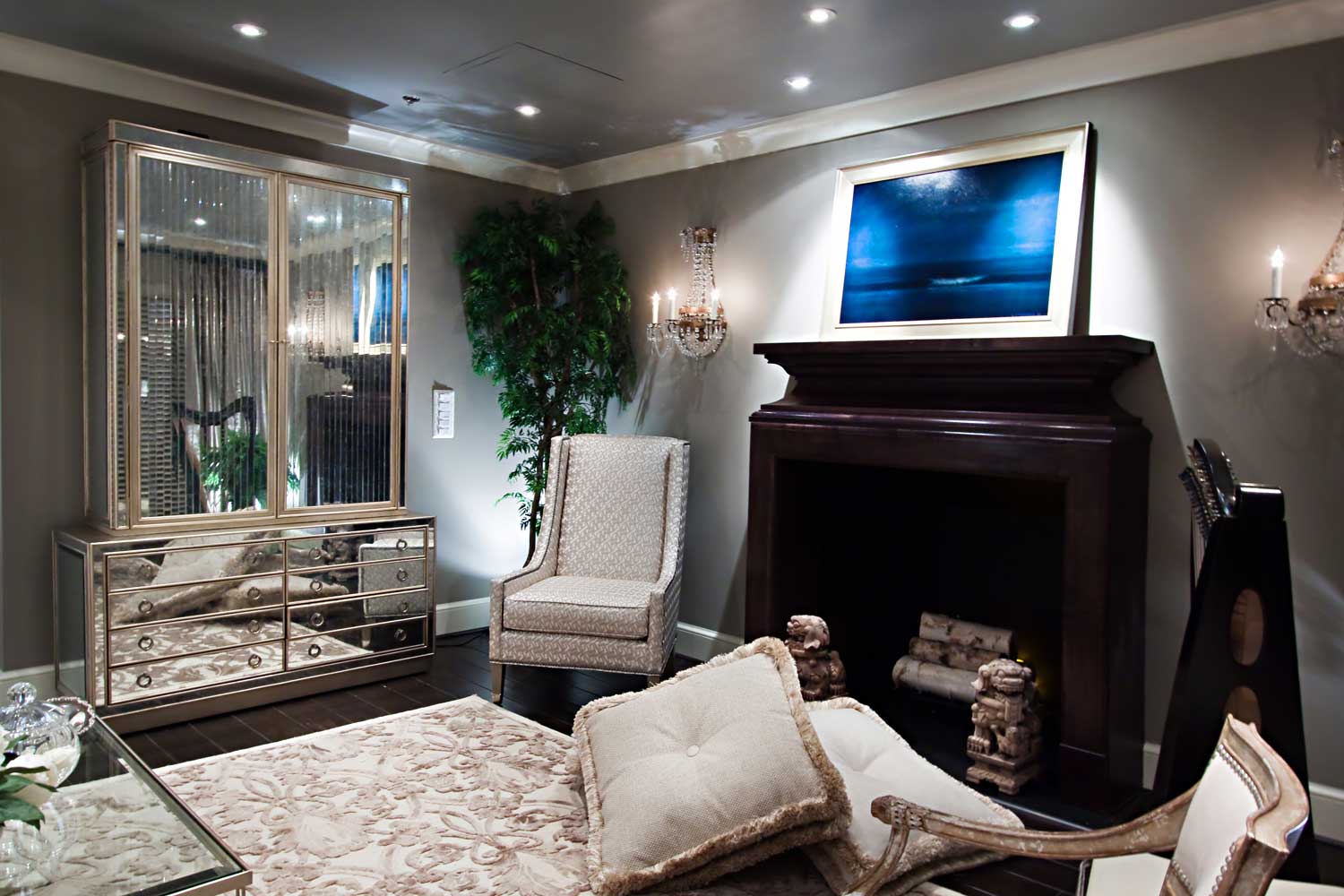
The challenge here was a room with no windows to the outside - indeed this was a room underground! We made it come alive with very specific interior design elements; many and various light sources, numerous reflective surfaces. Chair by Lee Jofa.
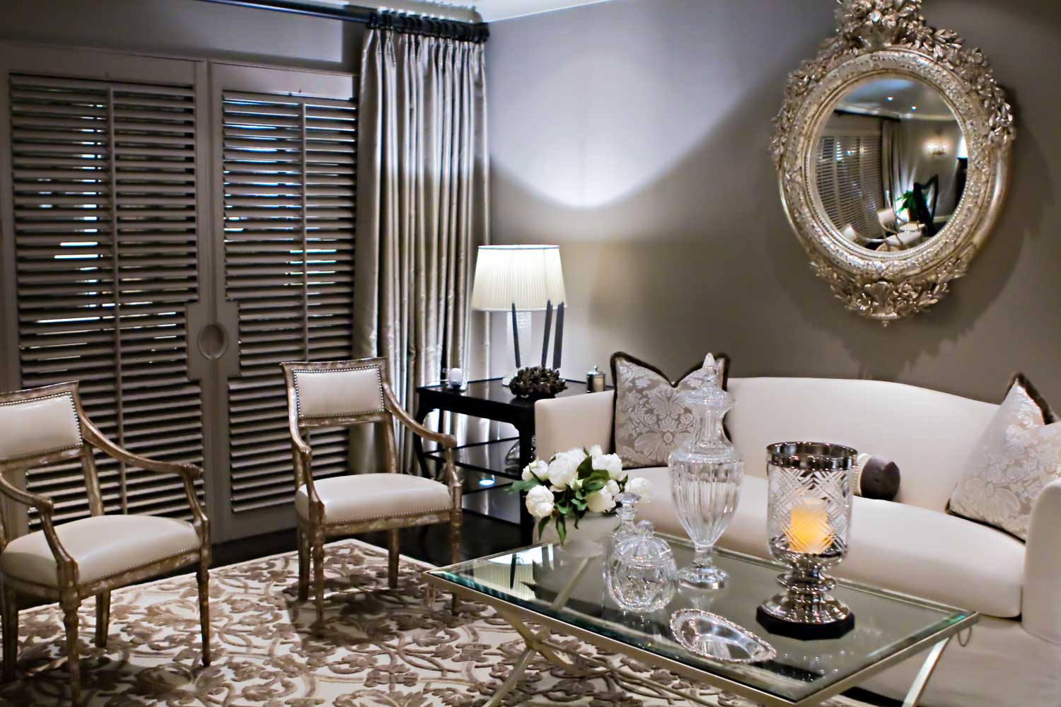
This subterranean room literally has no windows to the outside. We placed an entire wall of mirrors with custom shutter doors behind curtain panels to create the illusion of leading to an outdoor space.
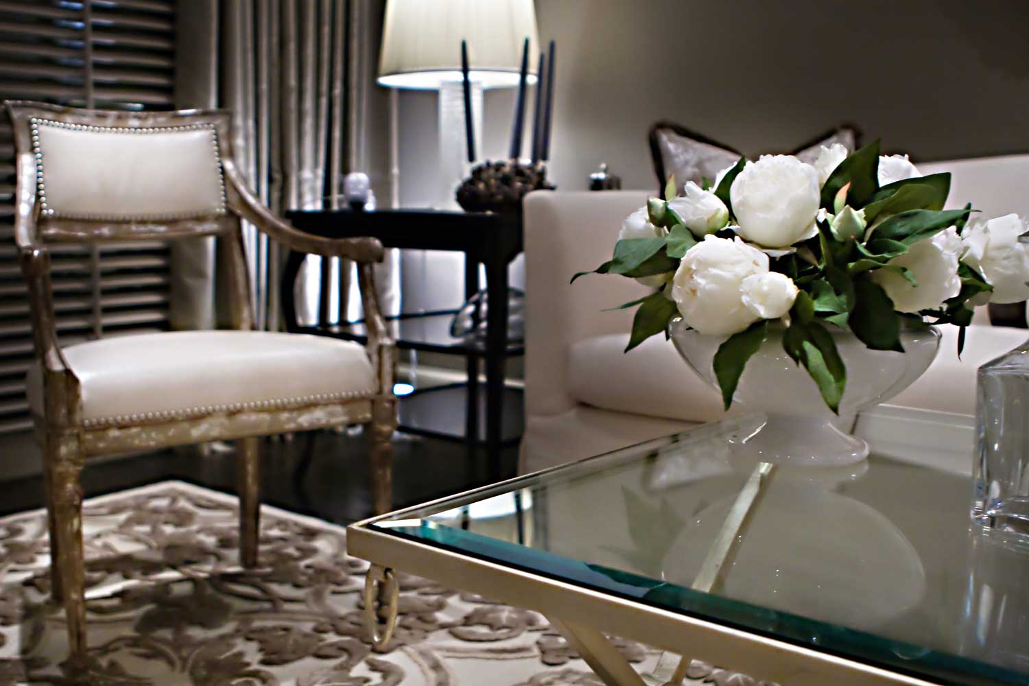
In this beautiful vignette, we have an intimate view of the interior design of this room - the antiqued Annecy Chair from Niermann Weeks plays beautifully against the contemporary Baker coffee table in a palette of silver and cream.
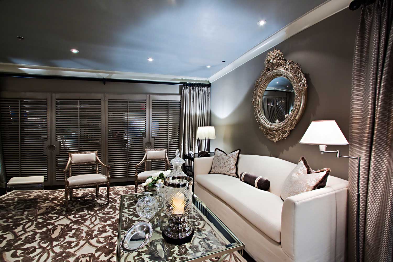
Although certainly very lovely, this space functions as a family room by day, and an elegant living room in the evenings. Not visible in this image, an over sized armoire with antiqued mirror contains the big screen TV, the Nintendo and Wii games with big throw pillows on the durable wool rug for the kids. The beautiful antiqued armchairs from Niermann Weeks are quite durable with leather padding.
For the adults, the room buttons up nicely, and the nicer things are positioned higher up in the room. The fact that there are no actual windows to this space goes unnoticed except for the mirrors behind the custom shutter doors! Black Walnut Fireplace surround designed by Forshew Design.
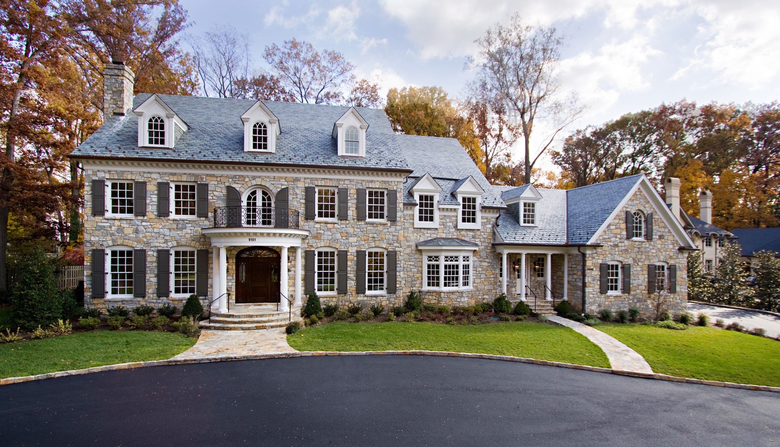
This stunning 15,000 sq. ft. custom colonial was designed by noted architect, John Katinas of Katinas Bruckwick Architecture firm. Located in the Burningtree neighborhood, the home easily appears as it has always been there.
Our role was to create the colour palettes, mouldings, kitchens and bathrooms to compliment to architecture. The scale of the home is only realized when one considers the size of the front door itself. The next image in the gallery also illustrates the scale of this home.
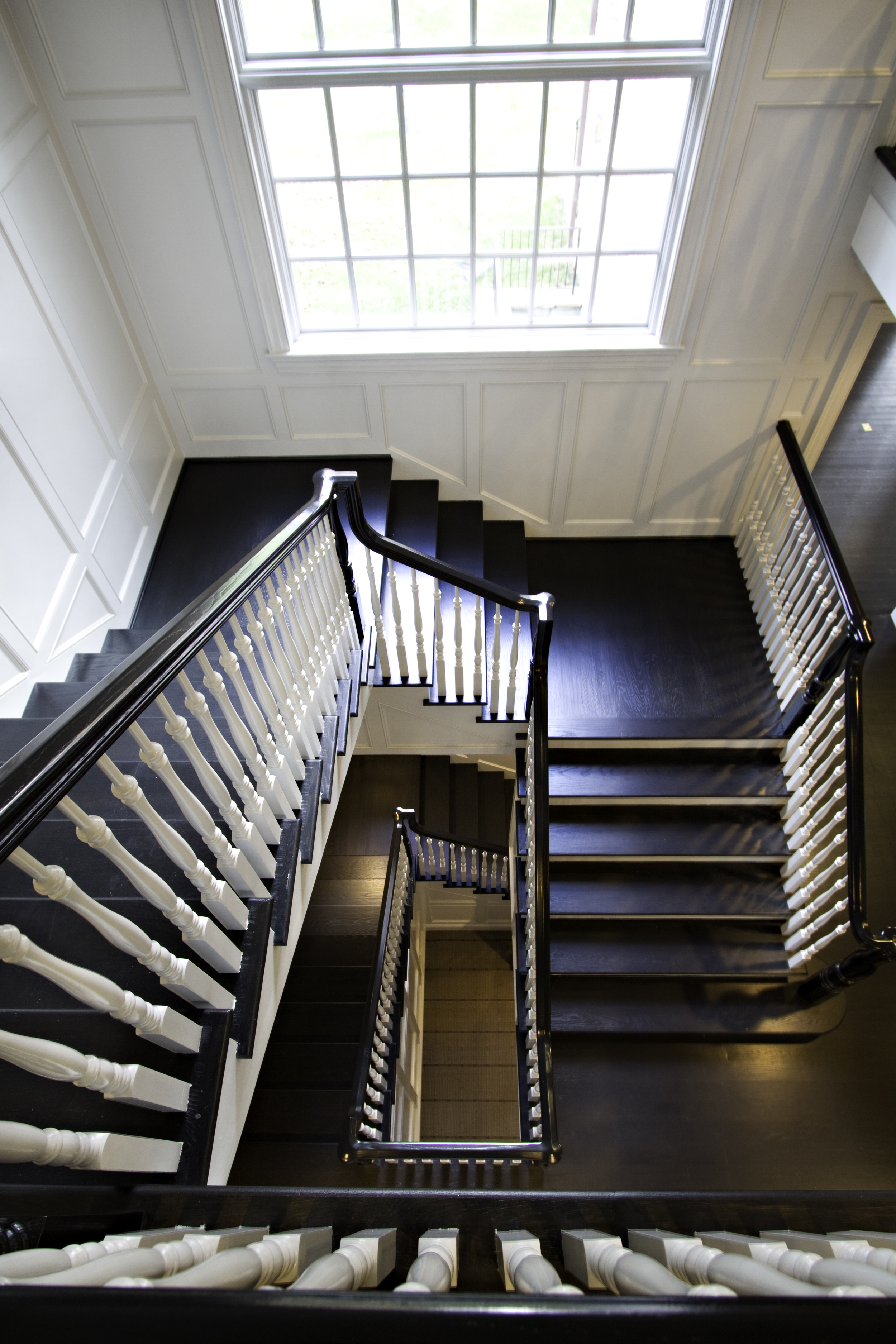
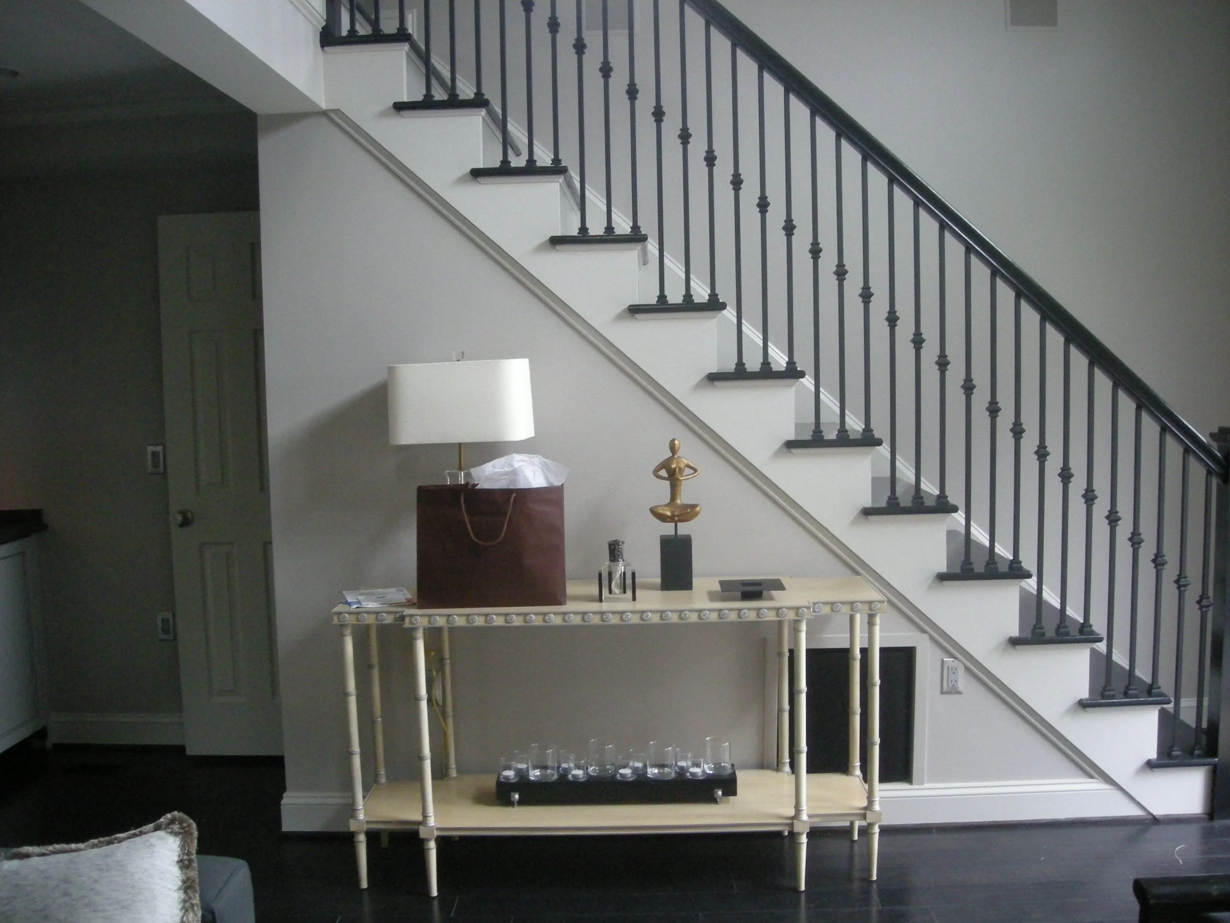
This unique angle shows the wonderful espresso/almost black custom stain on the hardwood, set against the alabaster white railings, risers and trim. The extra wide stairs which are set at the rear of the home is one of many subtle ways John Katinas kept the feeling more home-like. This home speaks to another era, and that is the complete allure.
Stain and paint colours custom through Forshew Design.
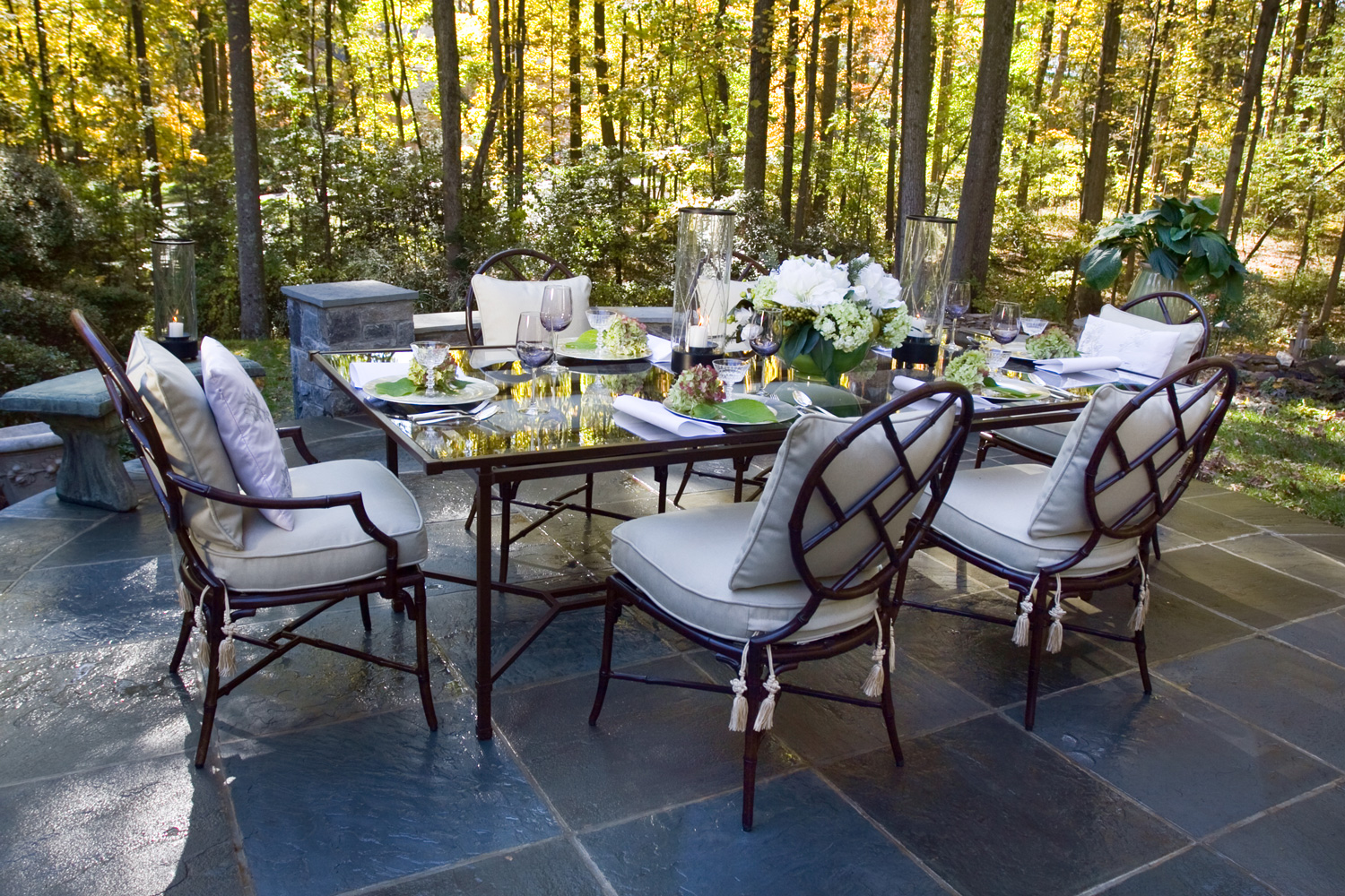
The interior design concept here was to provide an organic shaped patio with low walls, and not create a space that is almost exclusively dedicated for outdoor dining. Our design for the furniture was to reflect the round motif of the patio as well as the graphic from the patio stonework. Here, the Century Furniture's Orient patio set designed by Richard Frinier, complements perfectly.
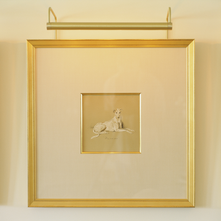
This detail shows how good framing and lighting can take something simple and elevate! This print was created by Lucy Dawson, a celebrated artist in the UK for her spontaneous caricature of peoples' dogs. Here, we began with a pure gold filet inner frame, with an oversized mat surrounded by a gold frame. The individual art light intensifies the effect, even more so in multiples - shown in another image in this gallery!
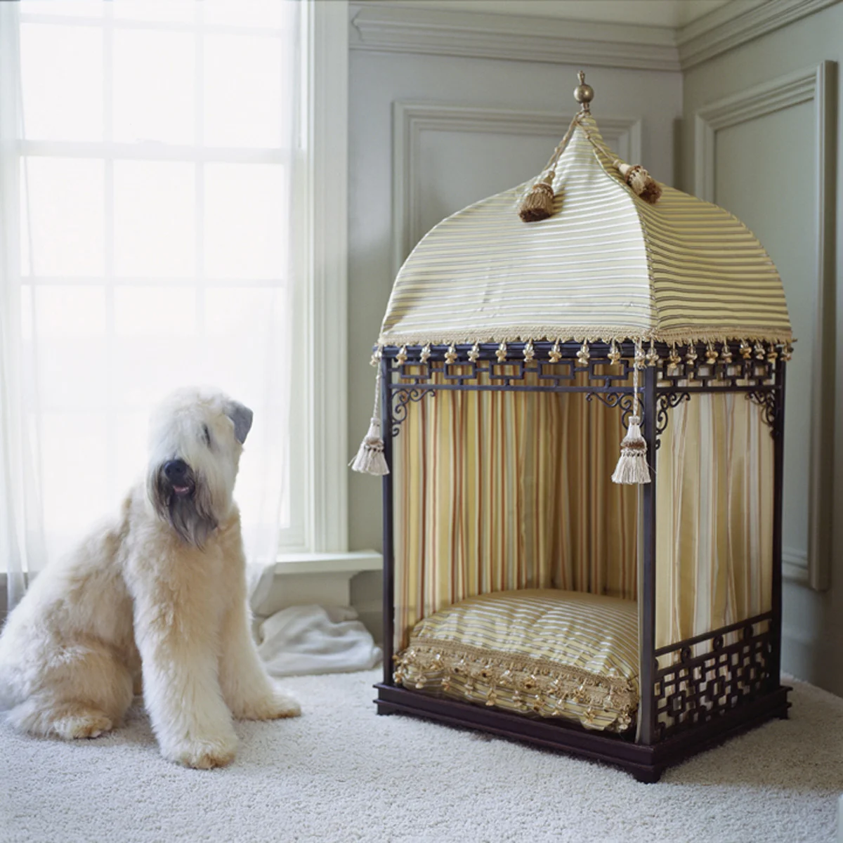
One of our custom designed dog beds, shows the "Ottoman" top, and created with the polyester fabrics used elsewhere in the room. The metal frame fits a standard sized pillow - easily washable. Many different top variations and side fittings allow for many options!
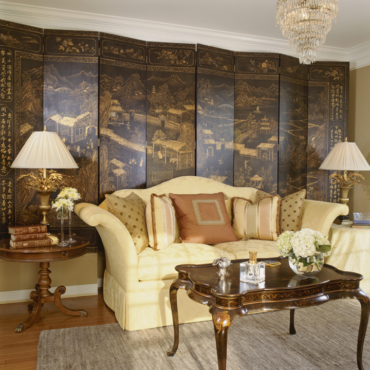
This wonderful, classic, traditional and tasteful living room shows the gracious and comfortable formality so important when entertaining with a purpose.
Note our signature ability to repeat the motifs in a room, with the curve of the sofa arm repeated in the shafts of wheat on the lamps, and the curves in the Maitland Smith coffee table legs. Chandelier antique in sterling silver.


Calming, Sophisticated and Life Enriching Interior Design
“Any room designed by Brad, will be beautiful and timeless.”
"I work in a very personal and human way. My goal is to gain your trust and through this we will deliver a space that is all about your personality."
Process - From a few furniture pieces to fill in a room – to doing several rooms, I quickly assess where my client is in the process - from pondering and still learning, to the person who just wants action right now. In matching my style of working with my Client’s needs, I can lead the process to meet their goals. In our conversations I learn your style, your desires and of course, your needs.
We match our style of working to our customers’ needs and lead the process to meet their goals. For example, if we need to expedite the timeline, we expedite the intake of style/function. We glean aesthetics through conversations, and by presenting images to encourage reactions. When ordering furniture or working with craftsmen, we make considered choices based upon quick delivery.
Ultimately, my role is to understand my client’s needs, and become a problem solver and define the story of their space. My process quickly informs how their home and lives will become better.
